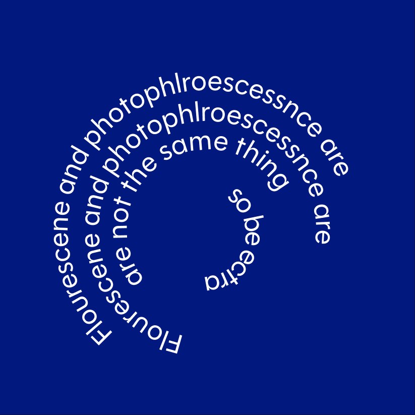
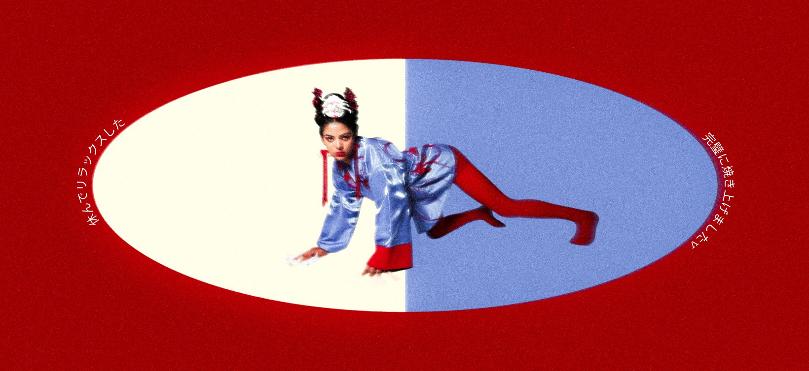
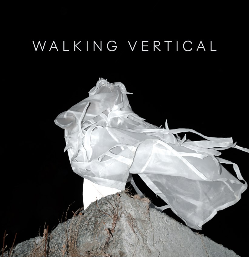
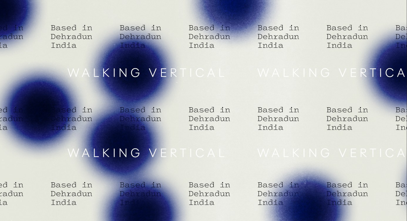
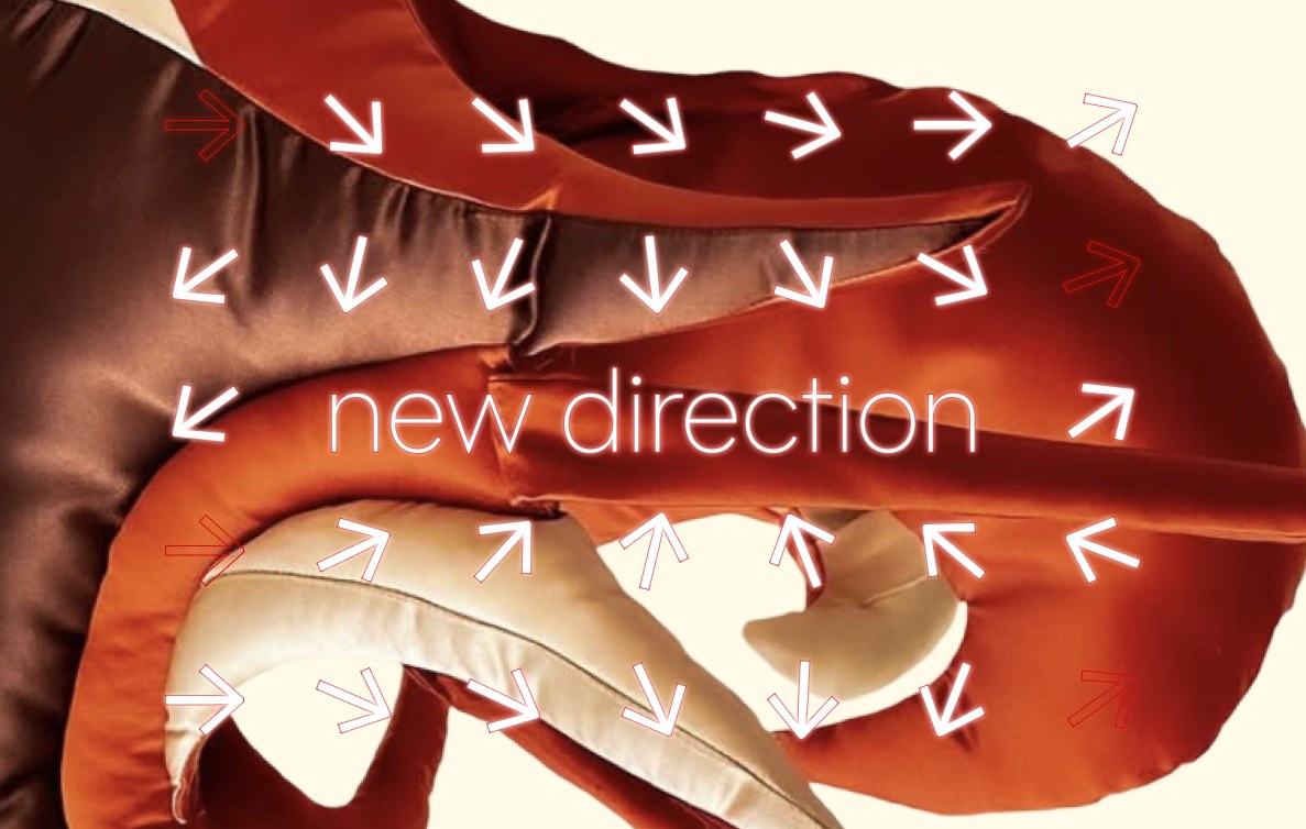
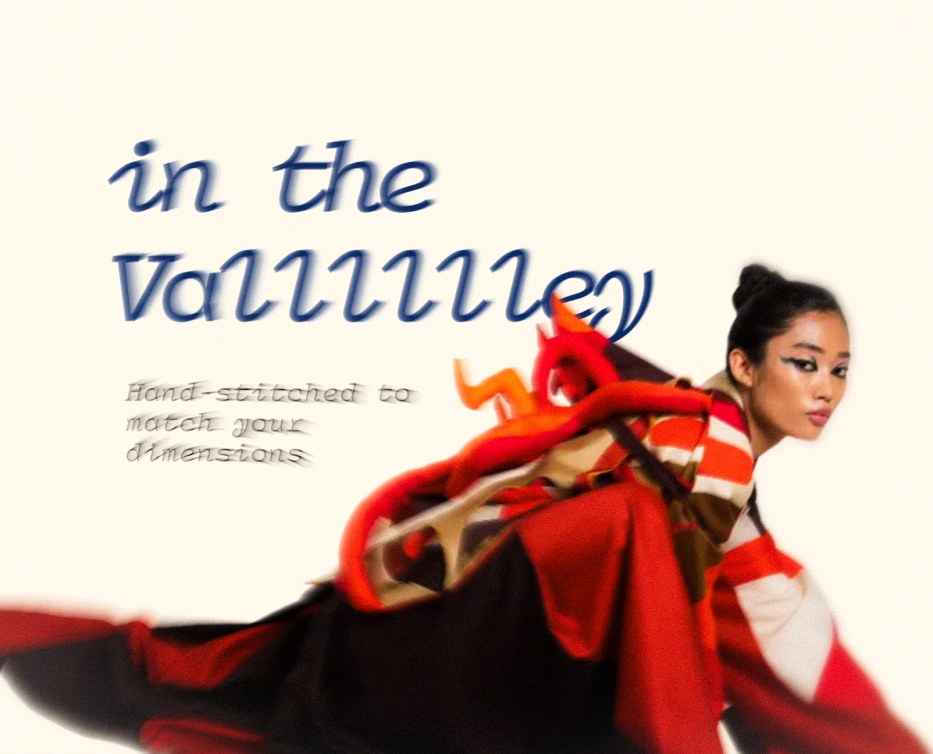
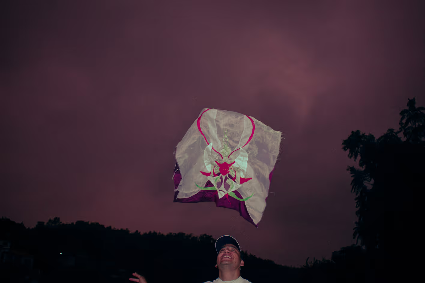
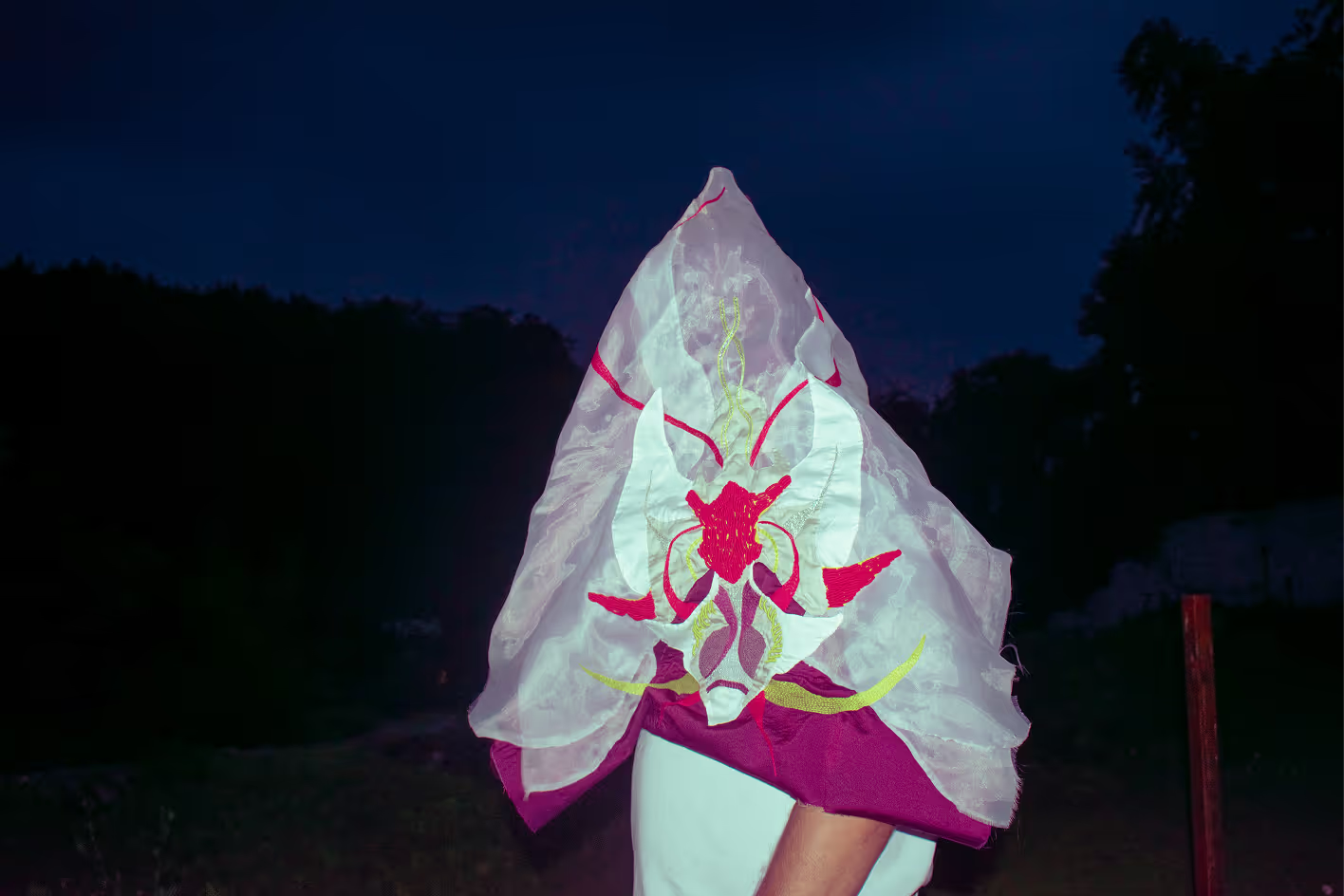
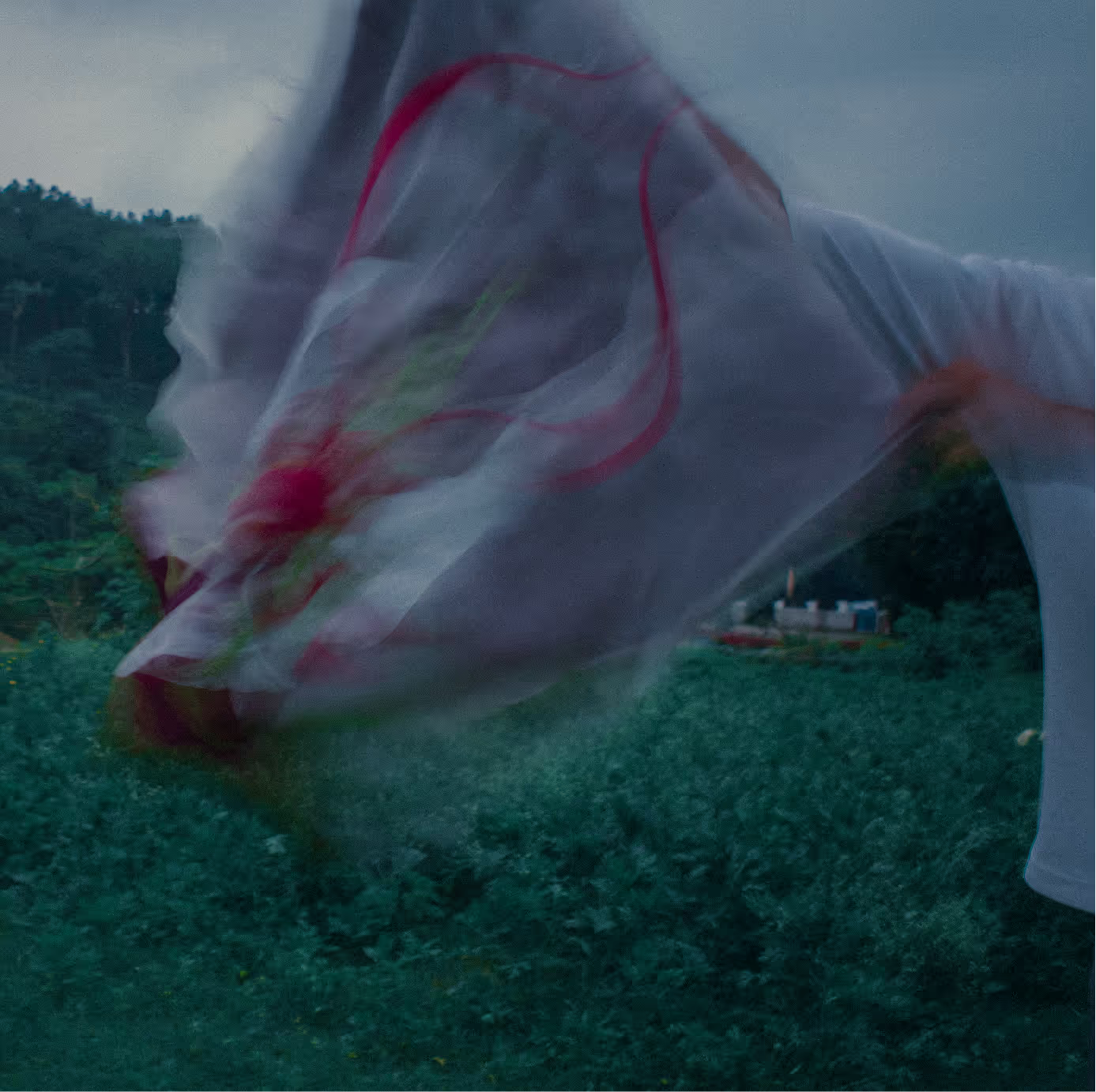
Walking Vertical mark in Blood Orange on CottonWalking Vertical mark and wordmark on NavyThe mark inside a deep blue orbFluorescence type spiral on Klein BlueModel in an oval frame, red and blue splitWalking Vertical white garment on a rock at nightBased in Dehradun pattern with blue orbsNew direction arrows over a red garmentIn the valley poster with a model in red
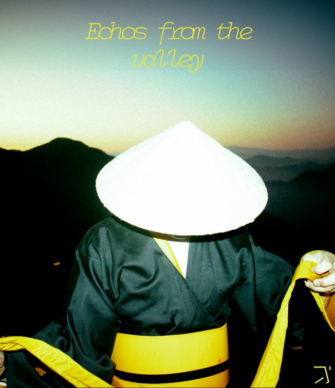
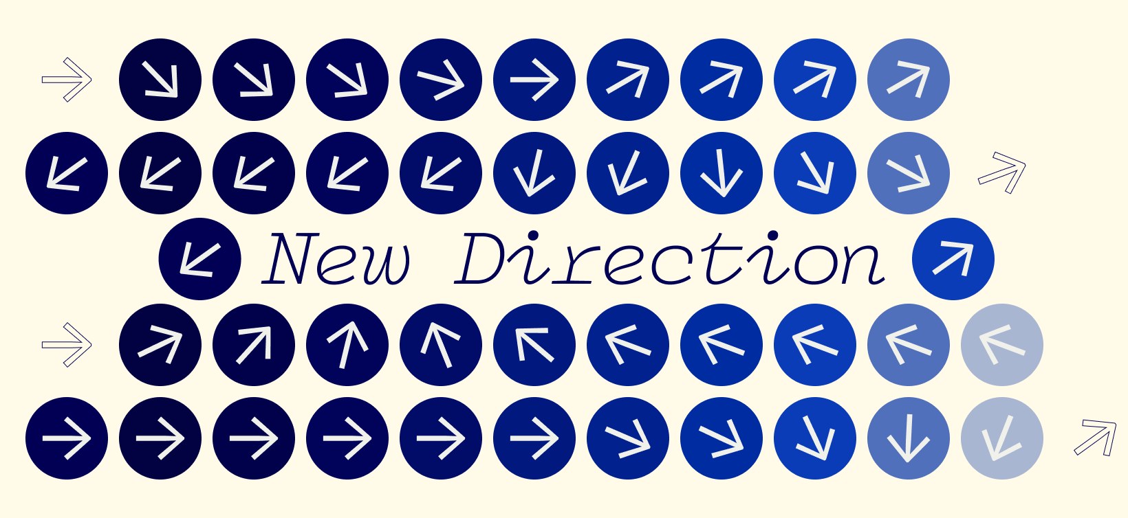
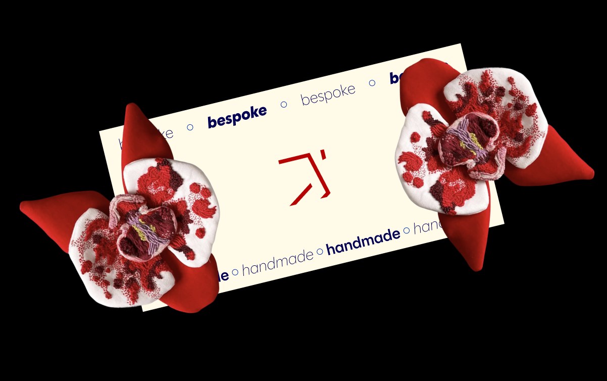
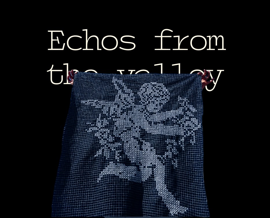
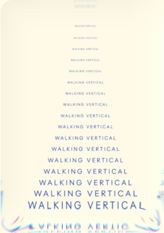
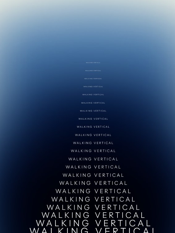
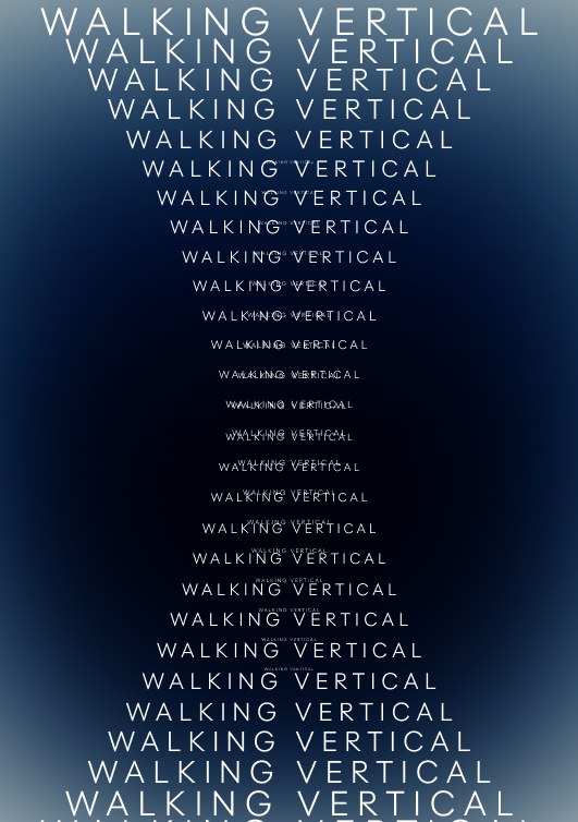
Echoes from the valley posterNew Direction arrow gridBaked to perfection garment gridBespoke handmade card with red flowersEchoes from the valley embroidered clothWalking Vertical type stack on CottonWalking Vertical type stack on blue gradientWalking Vertical type stack on Navy
Case study · Walking Vertical · Brand identity and art direction · 2022 to present

A stitch on the back of a garment, turned into a brand

Walking Vertical makes handmade, one-of-a-kind textile art in Dehradun. Its founder, Akash Patwal, had been hand-sewing a small WV stitch into his garments for years. In early 2023 I turned that stitch over, digitised the mark on its back and built the brand around it in five days. I have art-directed its images, films and shows ever since.
Client
Walking Vertical, a Dehradun fashion label founded by Akash Patwal in November 2020
Role
Art director and foundational designer: logo, identity, photography, film, social media, sound design and project management
Duration
Summer 2022 to present. The identity took five days in early 2023 and evolved in 2025
Platforms
Images, motion, sound, social media, events and the website
Team
Akash Patwal, founder and lead, and me as art director
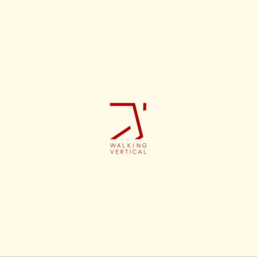
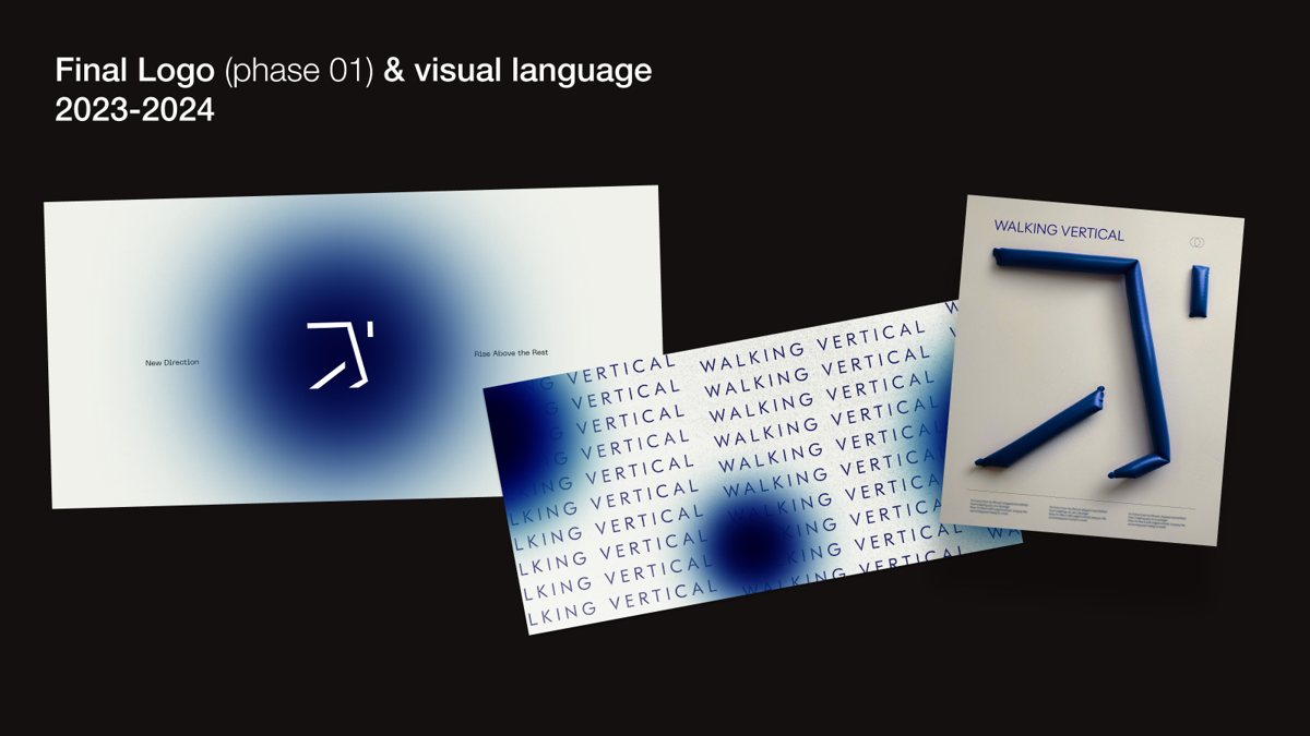
The final Walking Vertical logo and visual language, 2023 to 2024
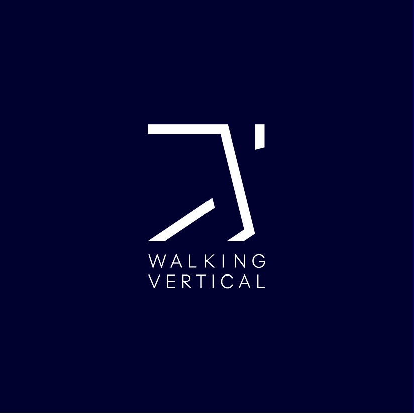
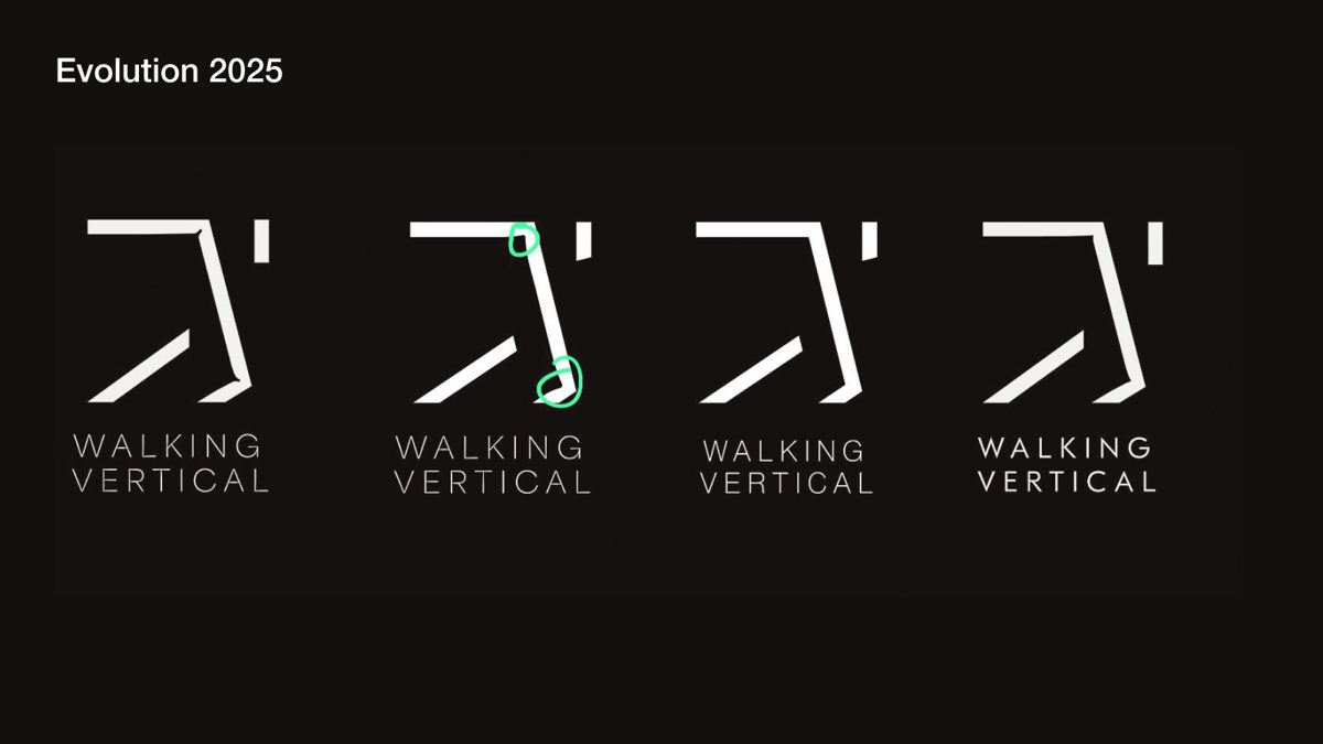
The Walking Vertical mark and wordmark, evolved in 2025
01

A label with a signature stitch, but no logo

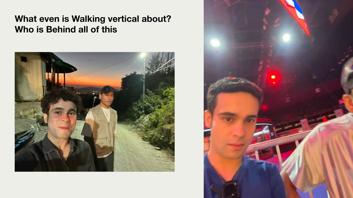
Who is behind it

A founder and an art director.

Akash founded Walking Vertical in Dehradun in November 2020: bespoke textile art made with embroidery, eco-printing and patchwork, often with local women and tailors he trains himself. I joined in Summer 2022 as art director and creative contributor, and, as my own slide puts it, friend of the founder.
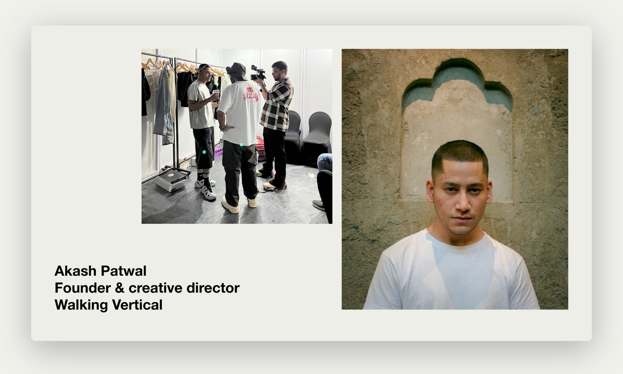
Akash Patwal, founder and creative director of Walking Vertical
Akash Patwal, founder and creative director.
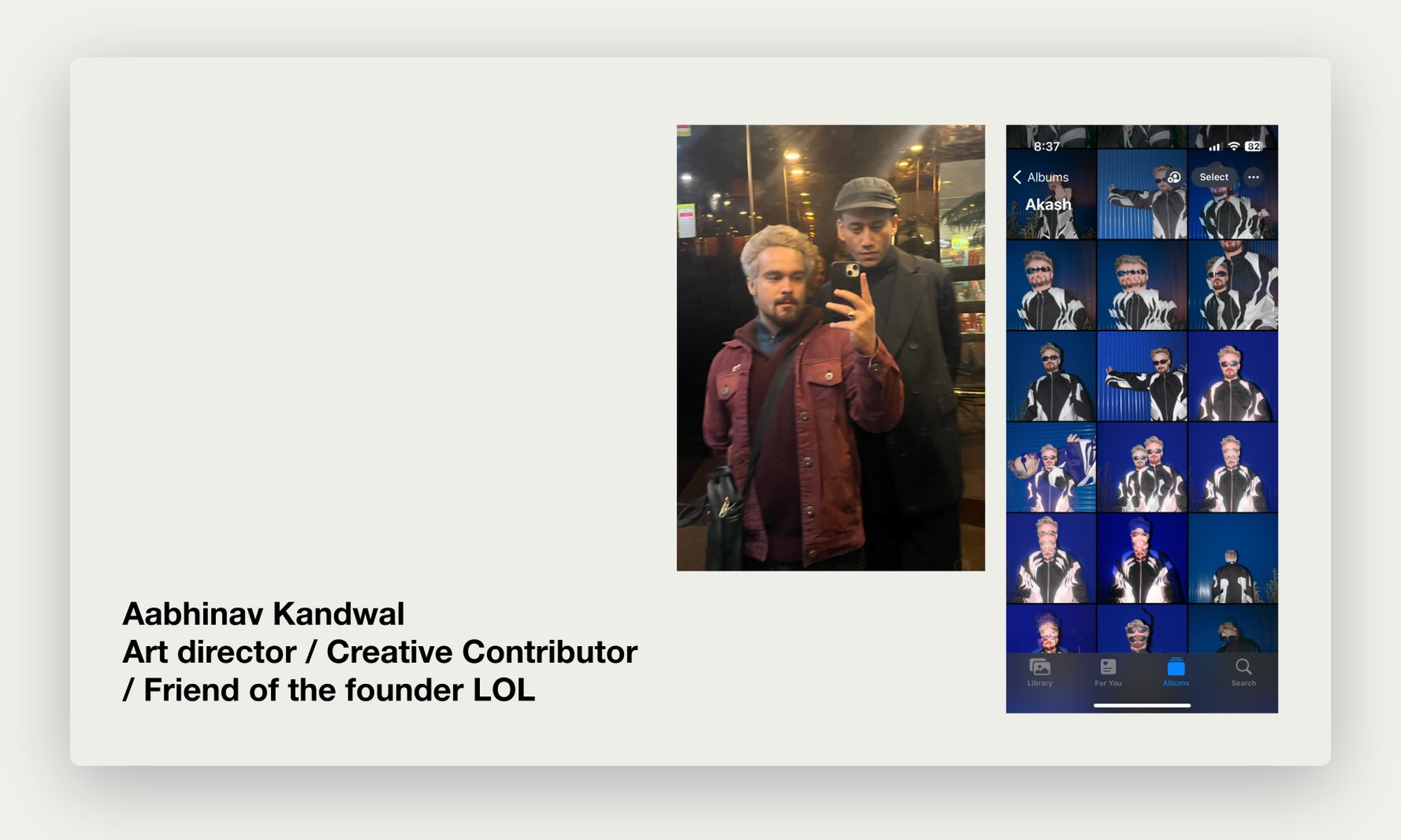
Aabhinav Kandwal, art director and creative contributor
Me: art director, creative contributor, friend of the founder.

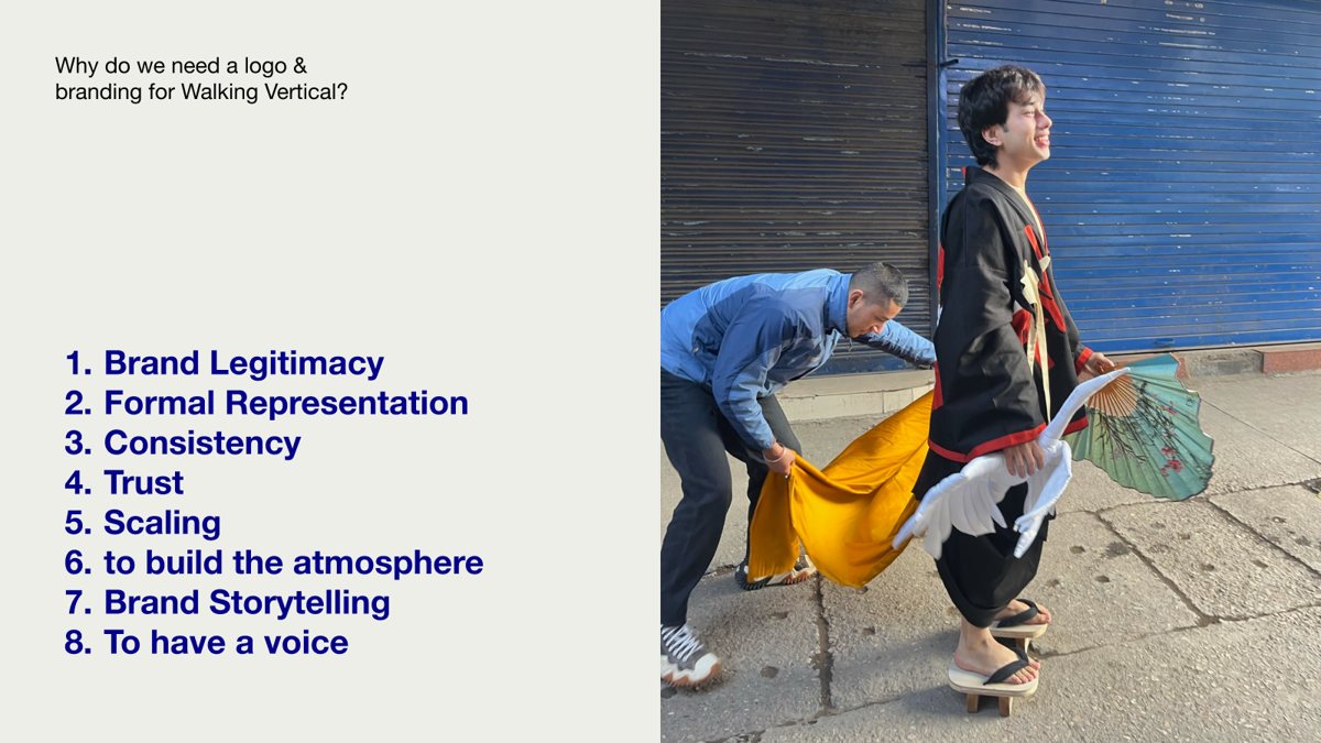
Why it needed a brand

Eight reasons on one slide.
01
Legitimacy and trust. A label selling one-of-a-kind pieces needs to look like it will still be there next season.
02
Consistency at scale. Tags, posters, shoots and stalls had to feel like one brand, whoever made them.
03
Atmosphere and story. The clothes already told a story. The brand had to set the mood around them.
04
A voice. Something to say beyond the garment itself.

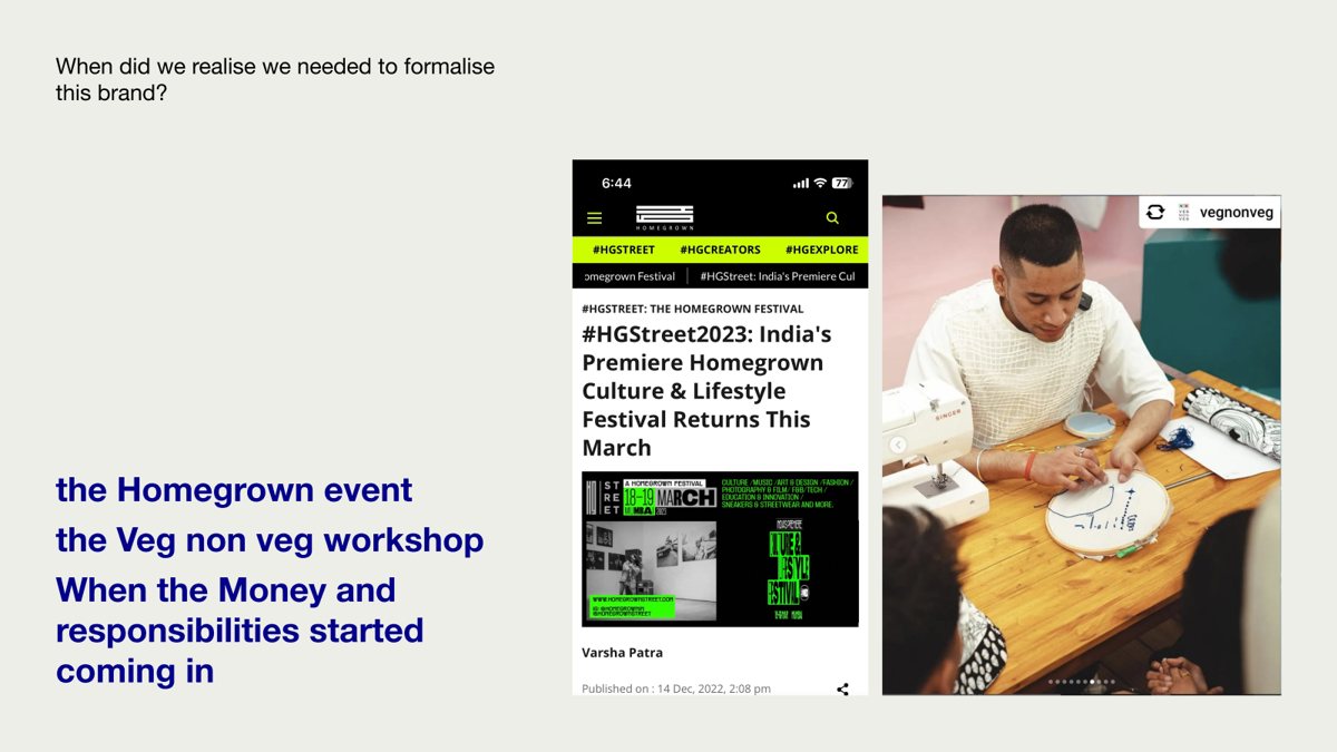
When it became urgent

Money and responsibility.

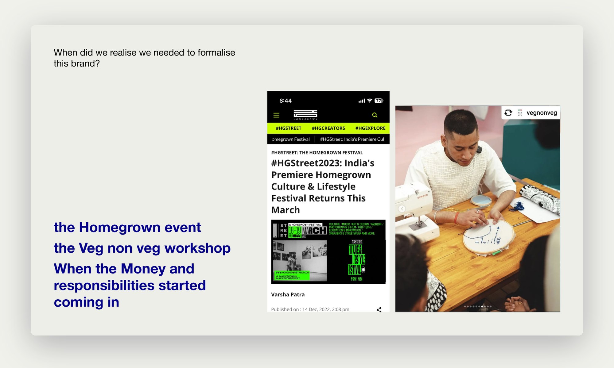
Three things made it real: Walking Vertical at the Homegrown street festival, a workshop with Veg Non Veg, and the point where money and responsibilities started coming in.
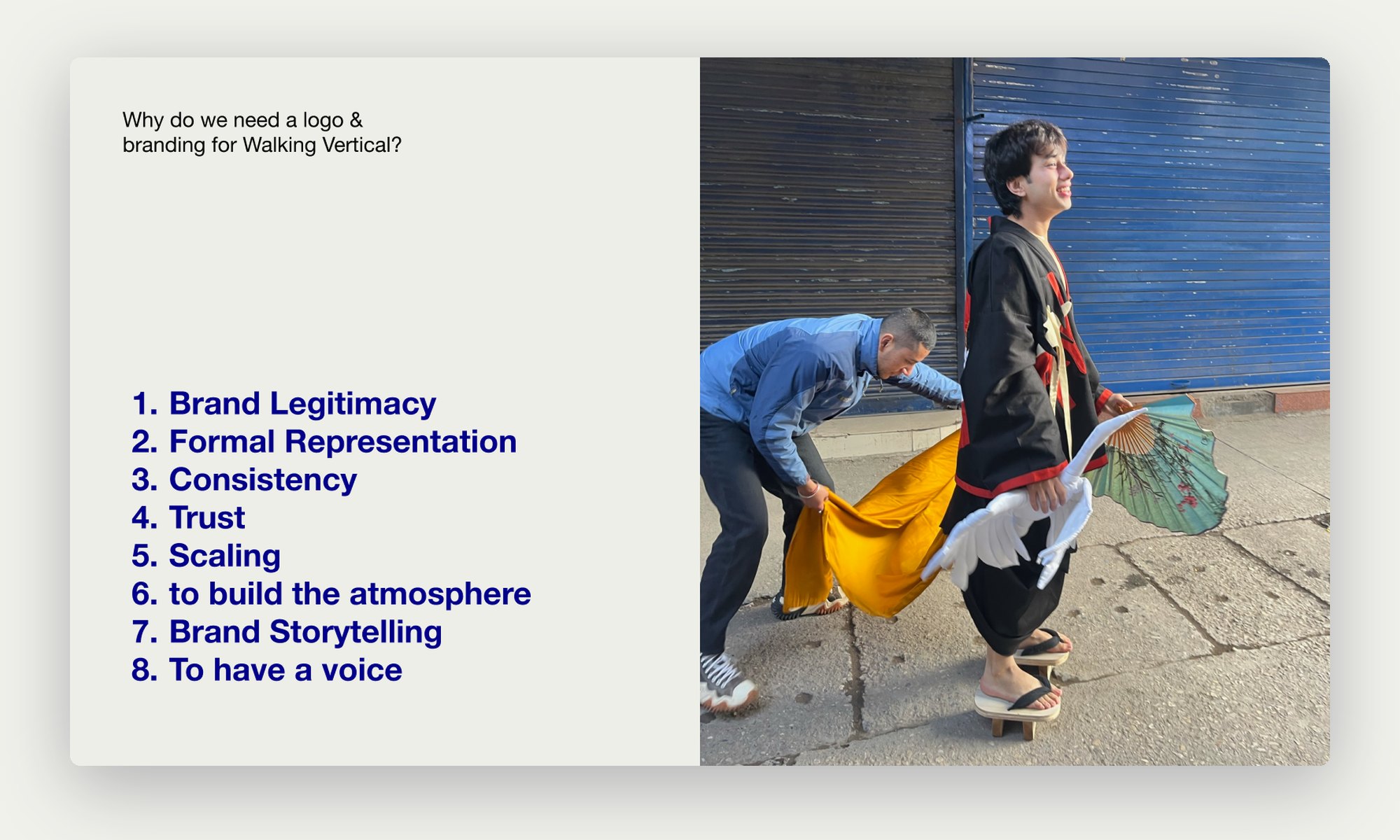
Slide listing why Walking Vertical needed a logo and branding
Why a logo and branding: legitimacy, representation, consistency, trust, scaling, atmosphere, storytelling and a voice.
Slide on the Homegrown event and the Veg Non Veg workshop
When we knew: the Homegrown event and the Veg Non Veg workshop.
02

It started with a T-shirt and a Grazia feature

A chance meeting

Summer 2022.

One evening in Summer 2022 I was hand-lettering a friend’s old T-shirt in Dehradun with the famous “No sleep, bus, club, another club” tour line. That is when I met Akash.

Grazia, our first job together

A photo, a print, a silver thread.

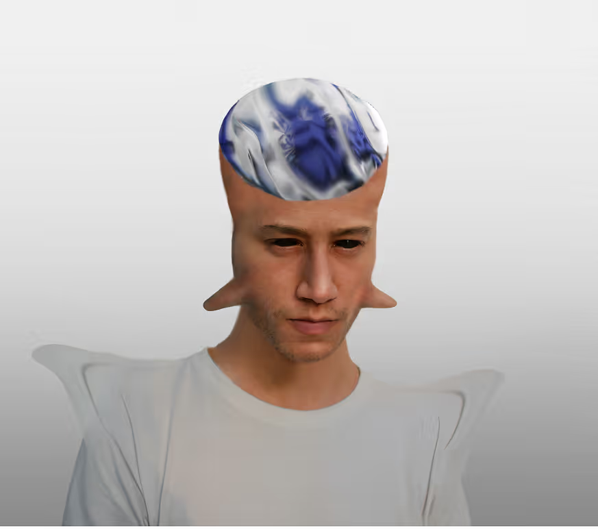
We hit it off without much introduction. Our first project was Akash’s introduction in Grazia. The idea was simple: photograph him, rework the picture in post, print it, and let Akash embroider over the print with silver thread. We found golden hour light and a plain white wall in the middle of Dehradun, which is harder than it sounds. I built his vision of a huge alien head with horns on the cheekbones, he stitched it, and we scanned and refined the piece. Next thing I knew, our work was in Grazia and I was modelling his garments.
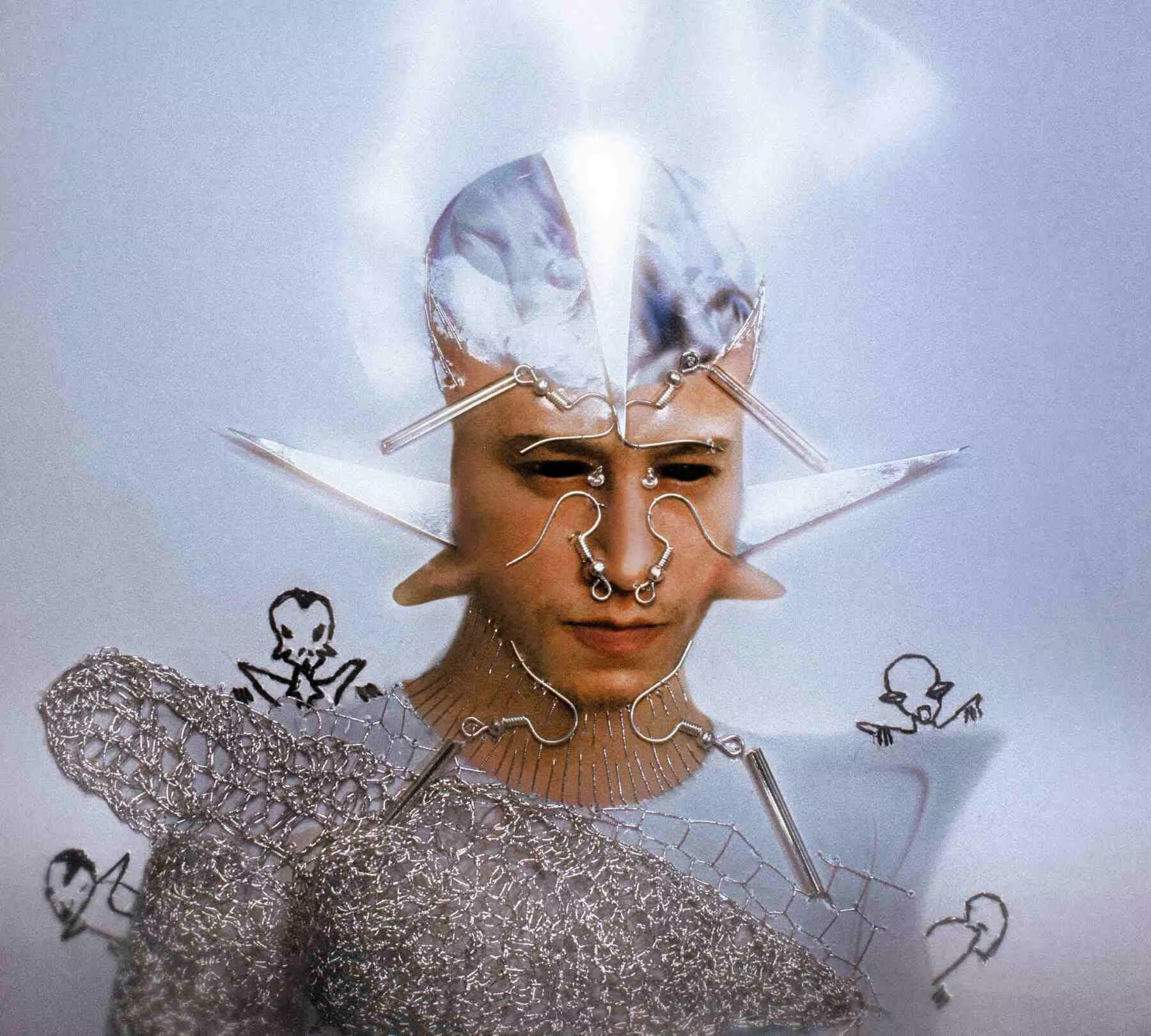
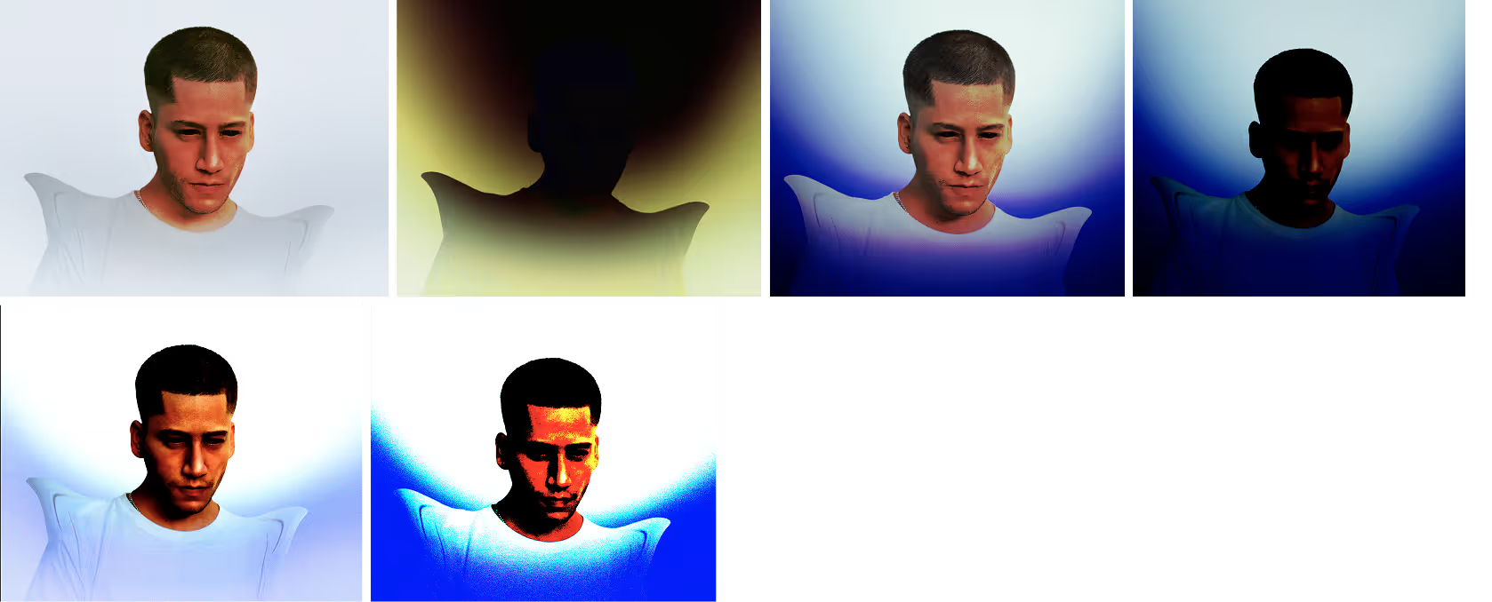
The embroidered, photo-manipulated portrait of Akash for Grazia
The final piece for Grazia: a manipulated portrait, printed and embroidered in silver thread. Read the article.
Embroidery in progress on the printed portrait
Akash embroidering over the print.
Detail of the silver thread embroidery
The silver thread detail, before rescanning.

Initial days

In front of the camera too.

Those first months were shoots, edits and a lot of trying things. Often that meant me in front of the camera.
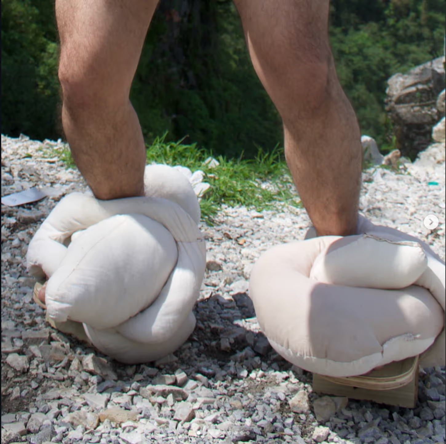
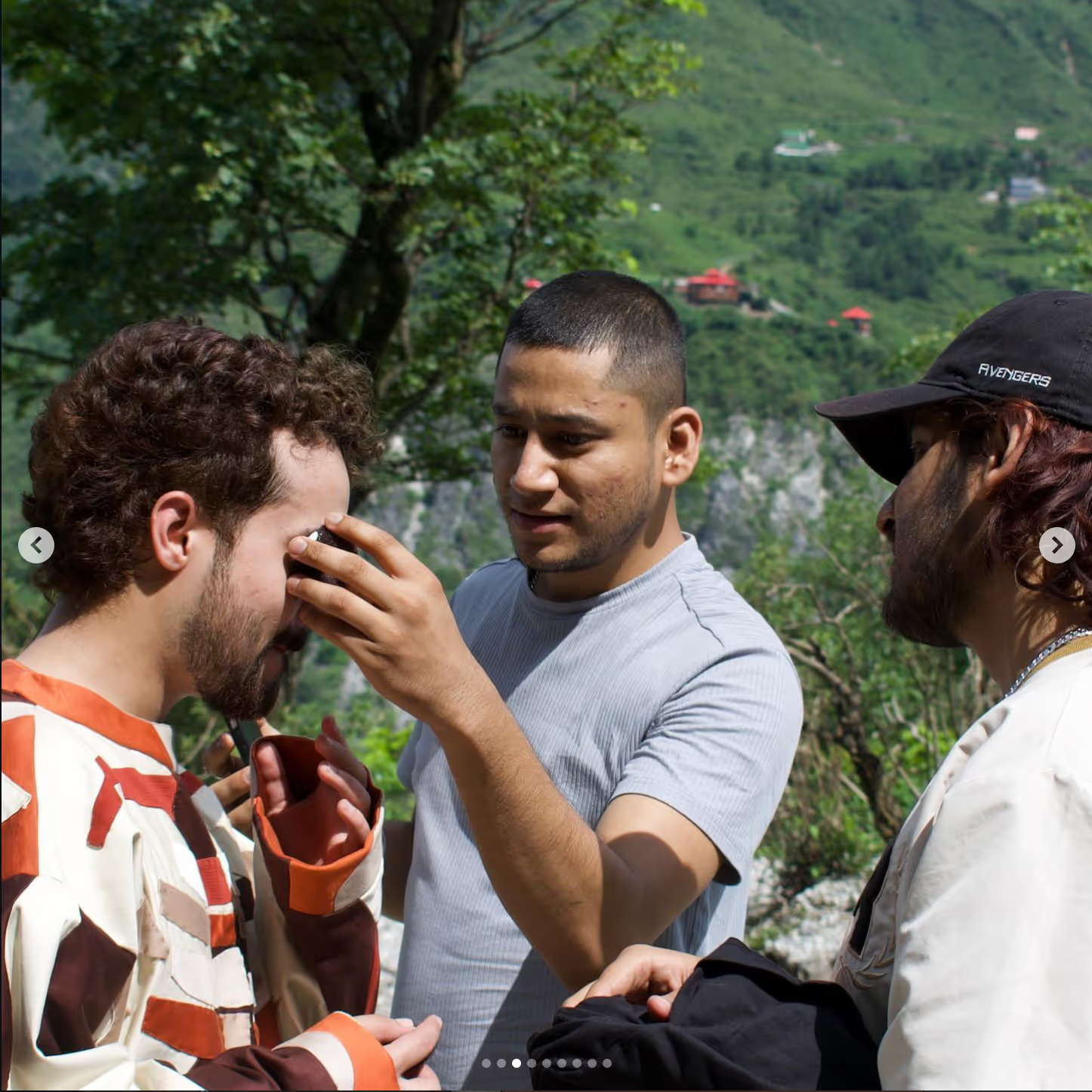
Behind the scenes of the first Walking Vertical shoot
Behind the scenes, Summer 2022.
Behind the scenes of the first Walking Vertical shoot
My first shoot as a model for Walking Vertical.
Behind the scenes of the first Walking Vertical shoot
Golden hour in Dehradun.
Behind the scenes of the first Walking Vertical shoot
Garments shot where they were made.
03

Decide what the mark has to carry

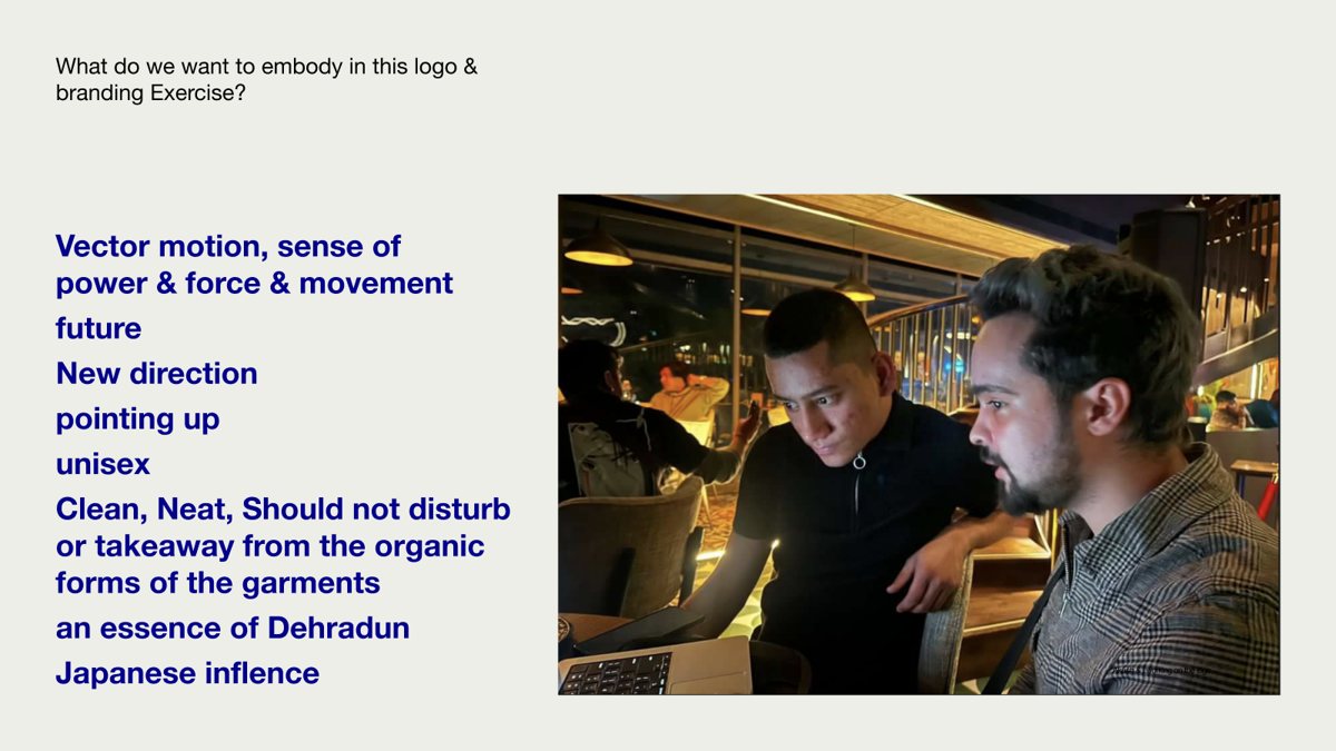
What it had to embody

Set before any sketch.
01
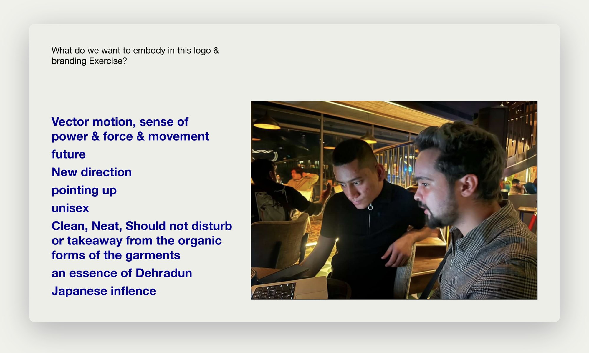
Movement. Vector motion, a sense of power, force and forward momentum.
02
A new direction. Pointing up, towards the future.
03
Unisex. For anyone who wears the clothes.
04
Quiet. Clean and neat, never competing with the organic forms of the garments.
05
Dehradun. An essence of the valley the label comes from.
06
Japan. The Japanese influence in Akash’s cuts and in the brand’s calm.
Slide listing what the logo should embody, with Akash and me at work
What we wanted to embody, and Akash and me working on it.
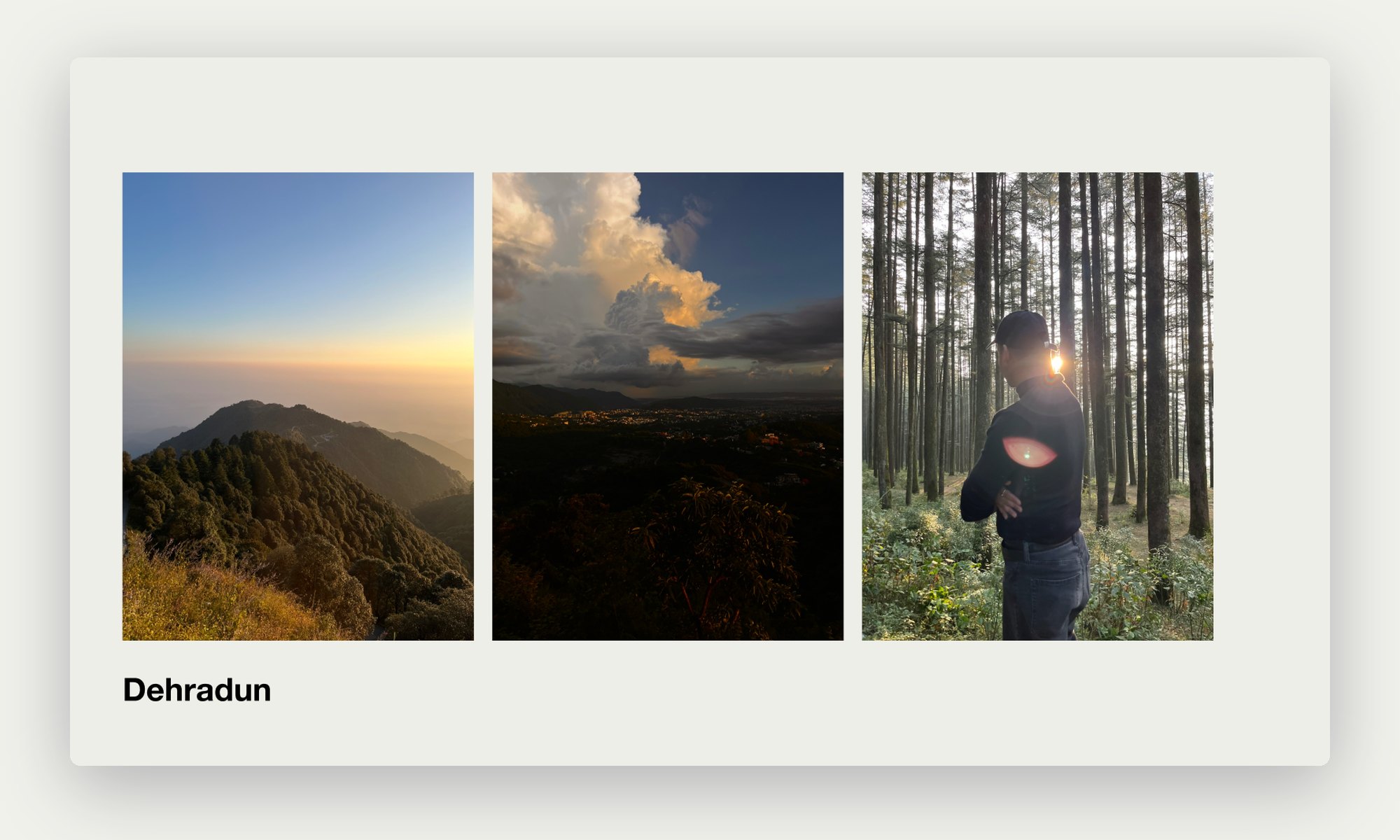
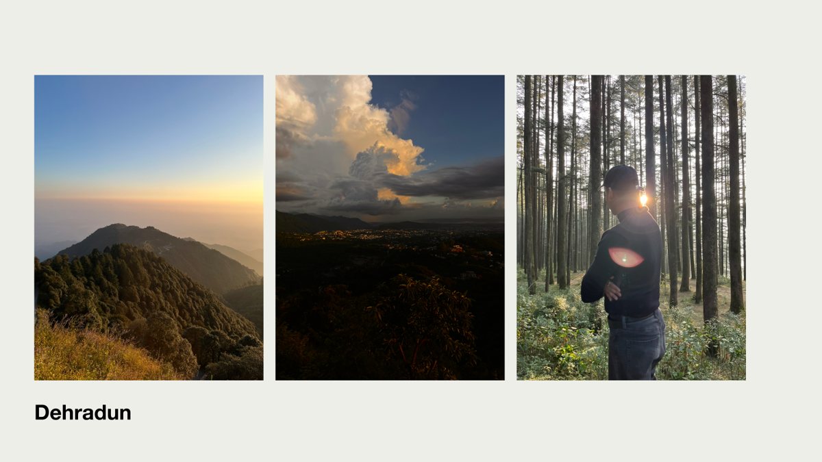
Dehradun landscapes at dusk and in the pine forest
Dehradun: the valley the palette would come from.

Who we looked up to

Benchmarks, not templates.

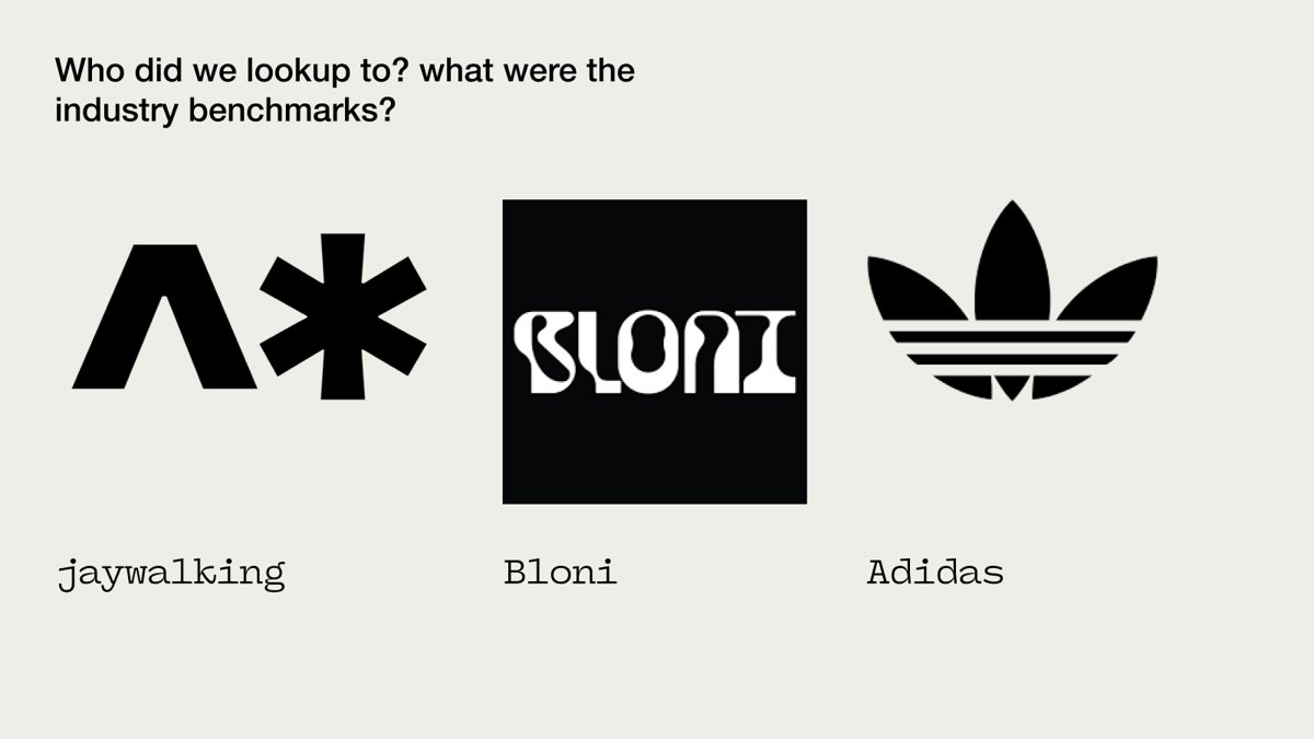
We looked at Jaywalking, Bloni and Adidas: marks that work as a symbol on their own, sit quietly on clothing and still feel loud on a poster.
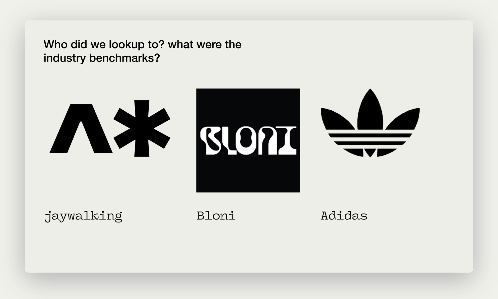
Industry benchmarks: Jaywalking, Bloni and Adidas
Industry benchmarks: Jaywalking, Bloni and Adidas.

Exploration and feedback

Letters first, then a mood.

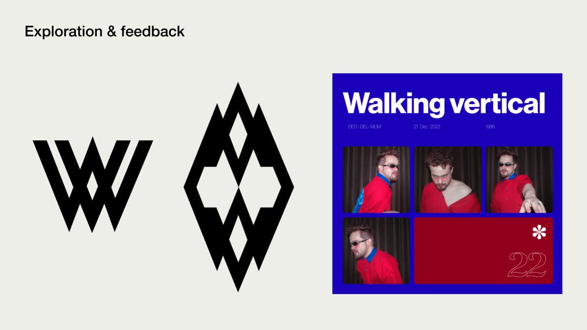
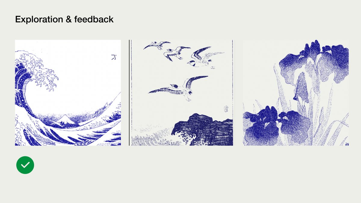
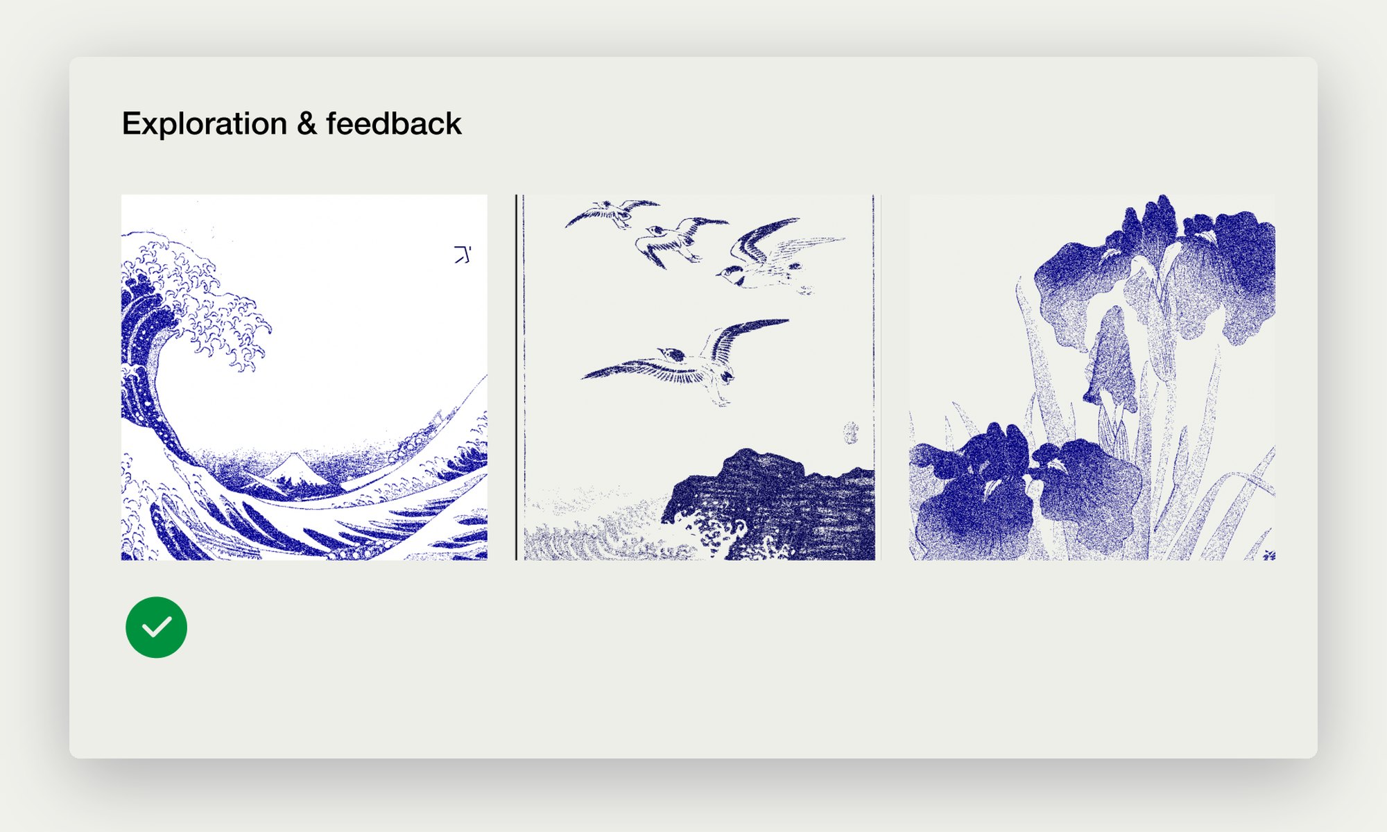
The first round explored letterforms: a W, a diamond of stacked Vs, a bold poster. Feedback moved us away from letters and towards the blue of Japanese woodblock prints, which got the tick and stayed.
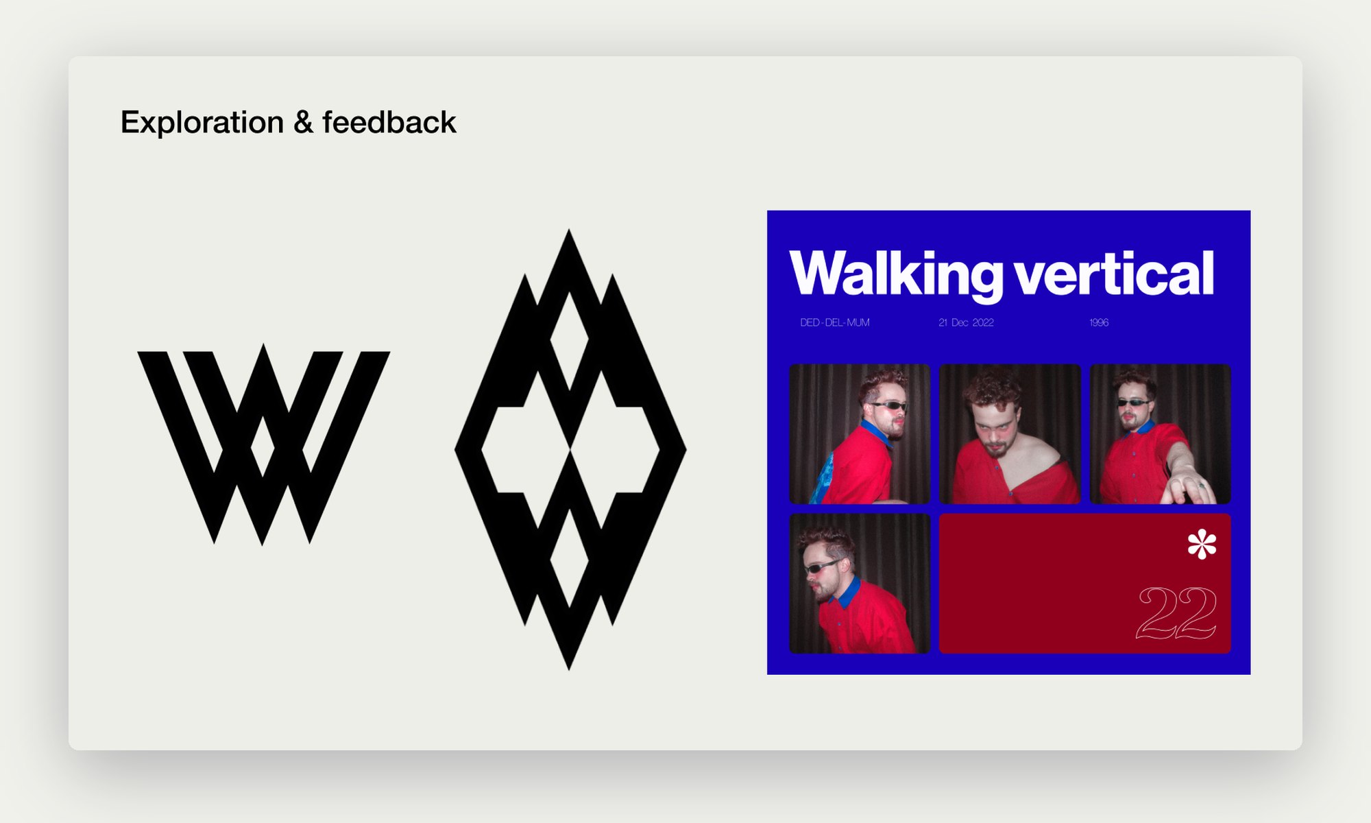
Early W logo explorations and a poster
First explorations: a W, stacked Vs and a poster.
Blue Japanese woodblock references, the approved direction
The blue woodblock direction that got the tick.
04

Walk the process, slide by slide

The step-by-step deck Akash and I built, laid out as a board in four lanes. Drag to move, scroll sideways, or use the controls to zoom and jump between lanes.
Drag to explore · Ctrl or ⌘ + scroll to zoom
01
Brief
Who, why and what.
Brief: Who
1.1
Who
Akash and me, Dehradun nights.
Brief: Dehradun
1.2
Dehradun
The valley behind the palette.
Brief: Why a brand
1.3
Why a brand
Eight reasons, from trust to a voice.
Brief: When
1.4
When
Homegrown, Veg Non Veg, money.
Brief: Embody
1.5
Embody
Movement, direction, Japan, Dehradun.
Brief: Benchmarks
1.6
Benchmarks
Jaywalking, Bloni, Adidas.
02
Explore
Letters, mood and the stitch.
Explore: Letterforms
2.1
Letterforms
Ws, stacked Vs, a poster.
Explore: Woodblock blue
2.2
Woodblock blue
The mood that got the tick.
Explore: The vibe
2.3
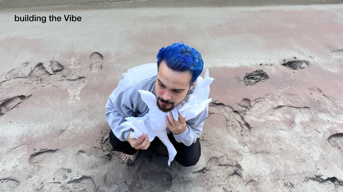
The vibe
Shooting the feeling.
Explore: The back side
2.4
The back side
The stitch, turned over.
03
The mark
From thread to vector.
The mark: Digitising
3.1
Digitising
Tracing the backside mark.
The mark: Construction
3.2
Construction
Angles and gaps on a grid.
The mark: Balancing
3.3
Balancing
Many versions of one gesture.
The mark: Symbol and font
3.4
Symbol and font
Testing the lockups.
The mark: Branding 2023
3.5
Branding 2023
Palette, type, Japanese line.
The mark: Phase 01
3.6
Phase 01
The 2023 to 2024 system.
04
In the world
Shoots, shows and 2025.
In the world: Stylescape
4.1
Stylescape
The visual language.
In the world: The bag
4.2
The bag
Sketches for the stuffed bag.
In the world: Posters
4.3
Posters
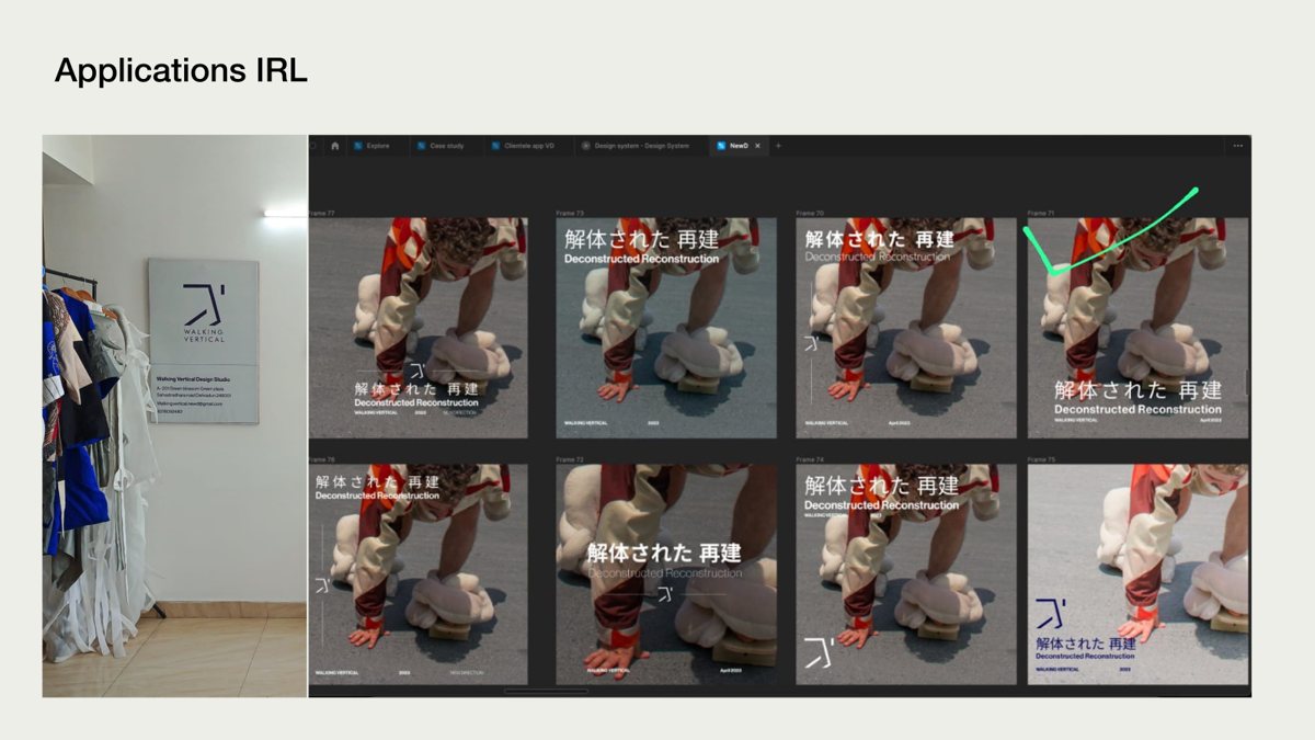
Deconstructed Reconstruction.
In the world: On the street
4.4
On the street
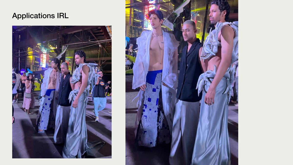
The clothes, worn.
In the world: Chasing perfection
4.5
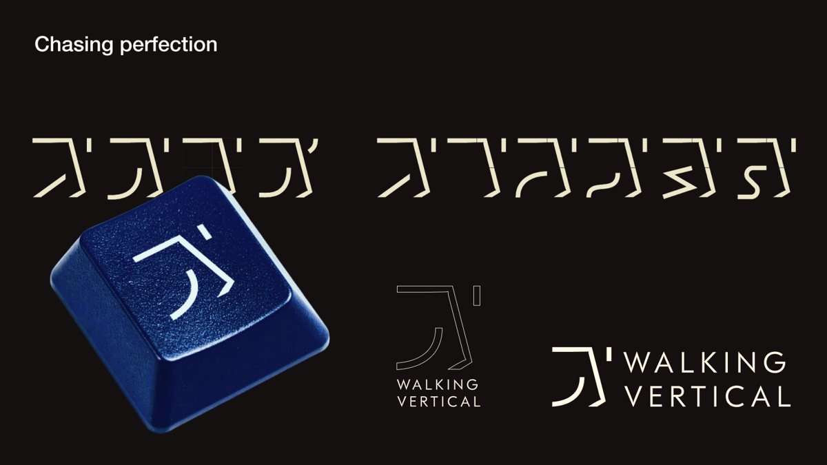
Chasing perfection
Refining the strokes.
In the world: Evolution 2025
4.6
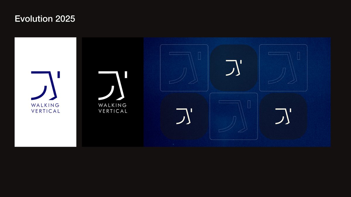
Evolution 2025
Deeper blues, new tiles.
In the world: The mark, 2025
4.7
The mark, 2025
Lockups, refined.
In the world: Logo system
4.8
Logo system
From the 2025 guidelines.
In the world: Colour
4.9
Colour
Obsidian to Blood Orange.
05

The logo was already sewn in

The back side of sewing

Found, not invented.

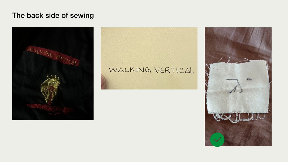
Akash had been hand-sewing a small WV stitch into his garments. Turned over, the back of that stitch read as a figure mid-stride: an angular body leaning forward and up. Everything we had listed, movement, direction, quiet and a calligraphic Eastern gesture, was already there in thread.
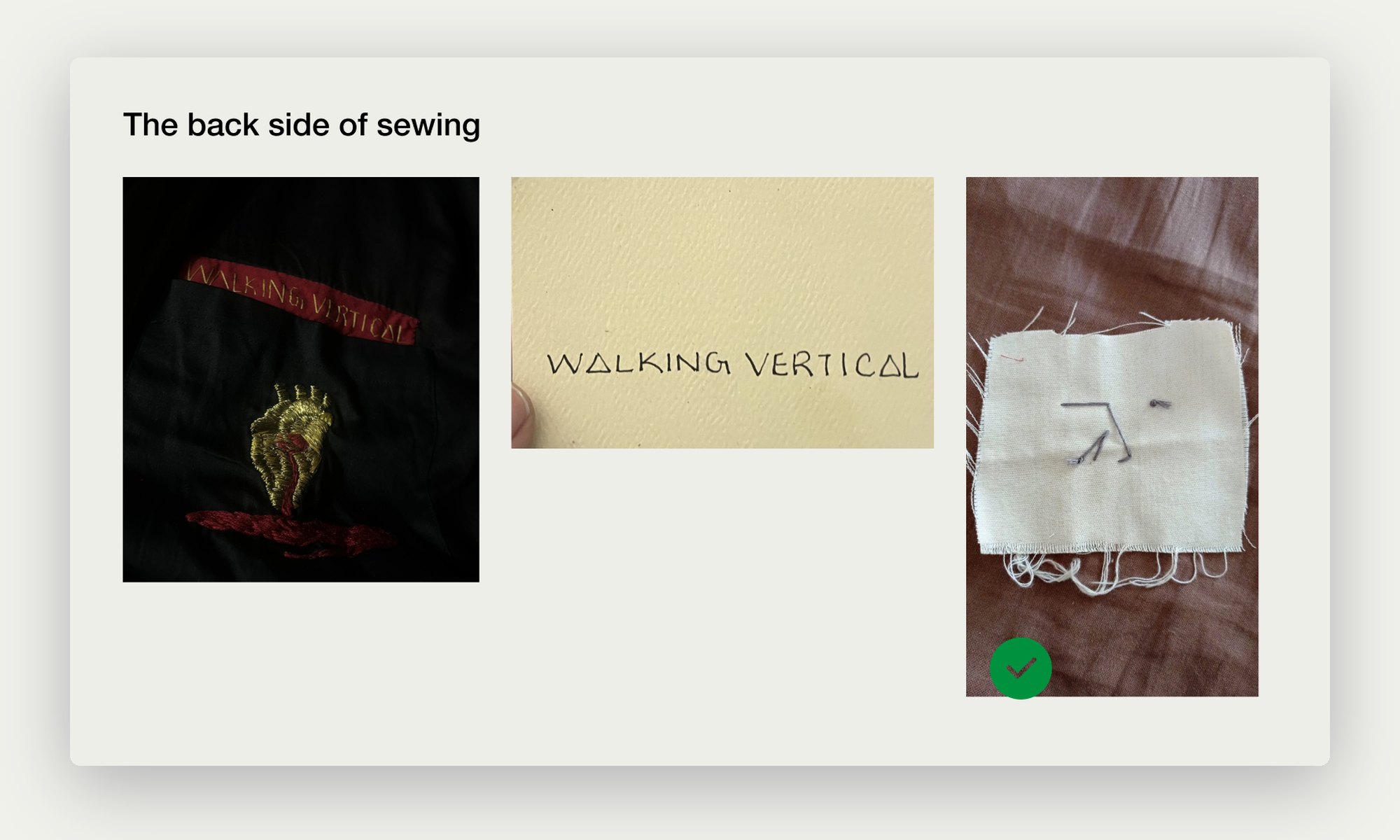
The back side of the hand-sewn WV stitch on fabric
The back side of the sewing: the mark, before it was a mark.

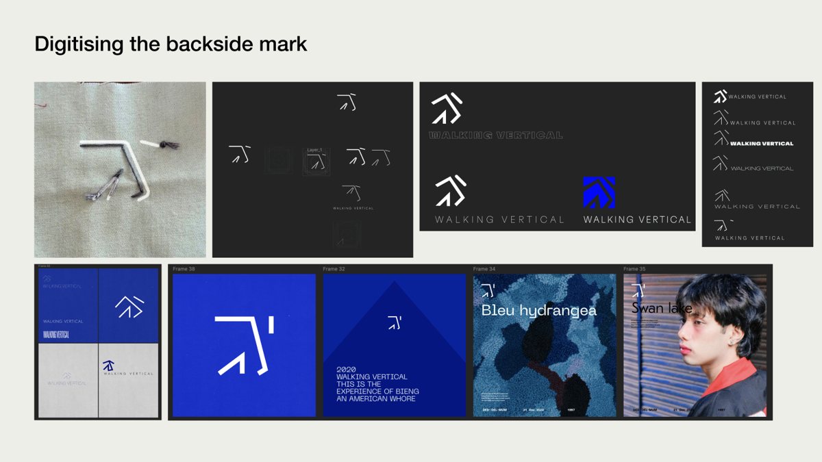
Digitising the backside mark

From thread to vector.

I traced the stitch and rebuilt it as a vector, then tested it straight away where it would live: on black, on blue, on tags, posters and editorial layouts. Seeing it in use early told us more than any mood board.
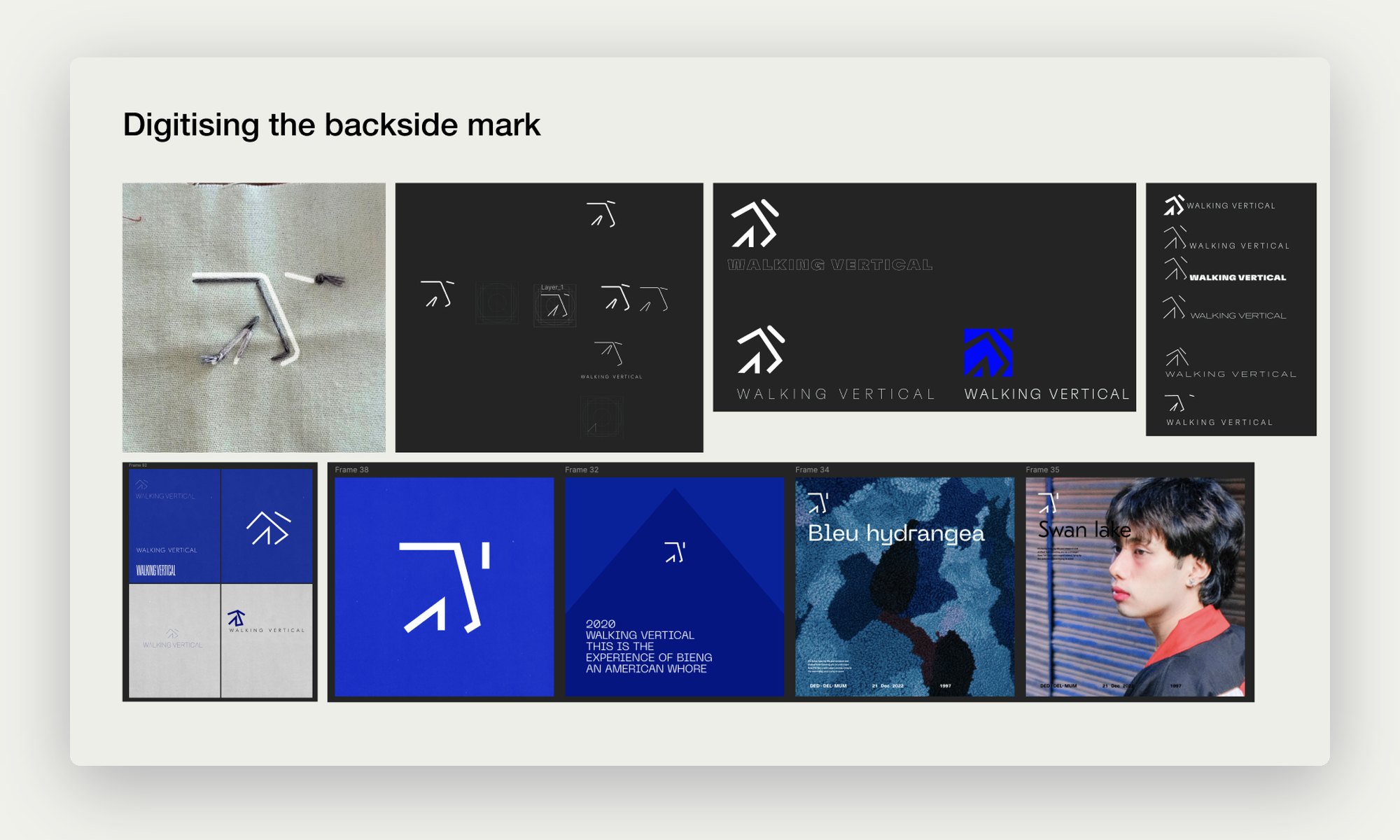
The digitised mark tested on dark and blue backgrounds and layouts
The digitised mark, tested on dark grounds, blue and layouts.
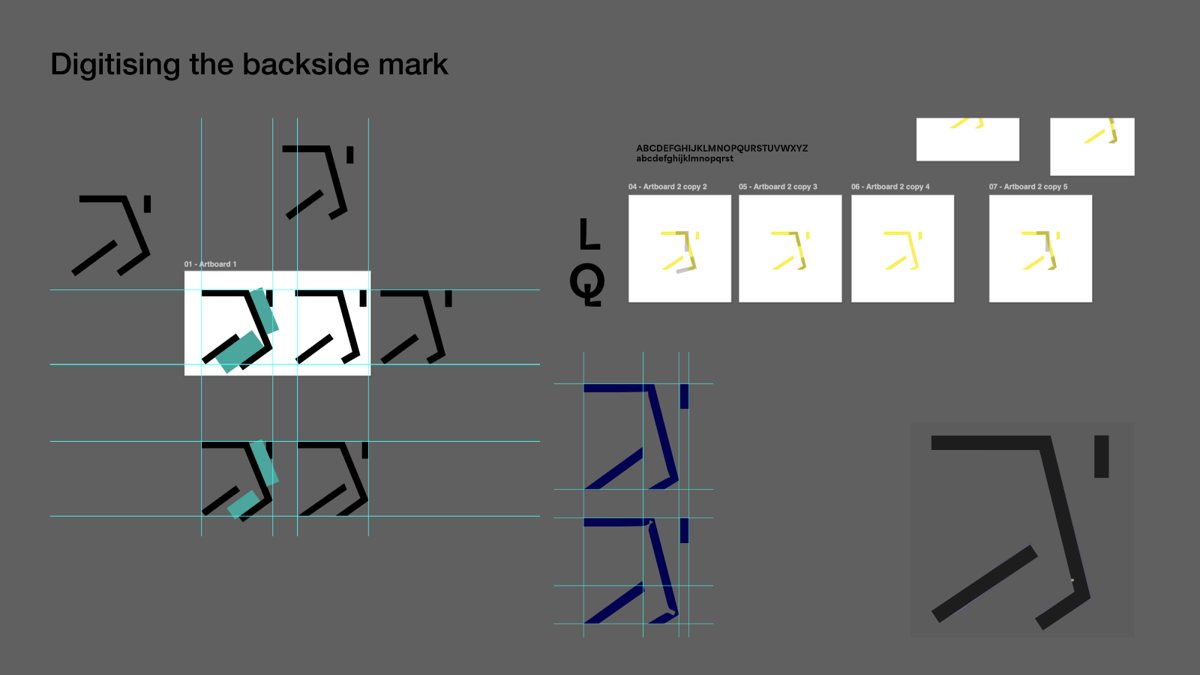
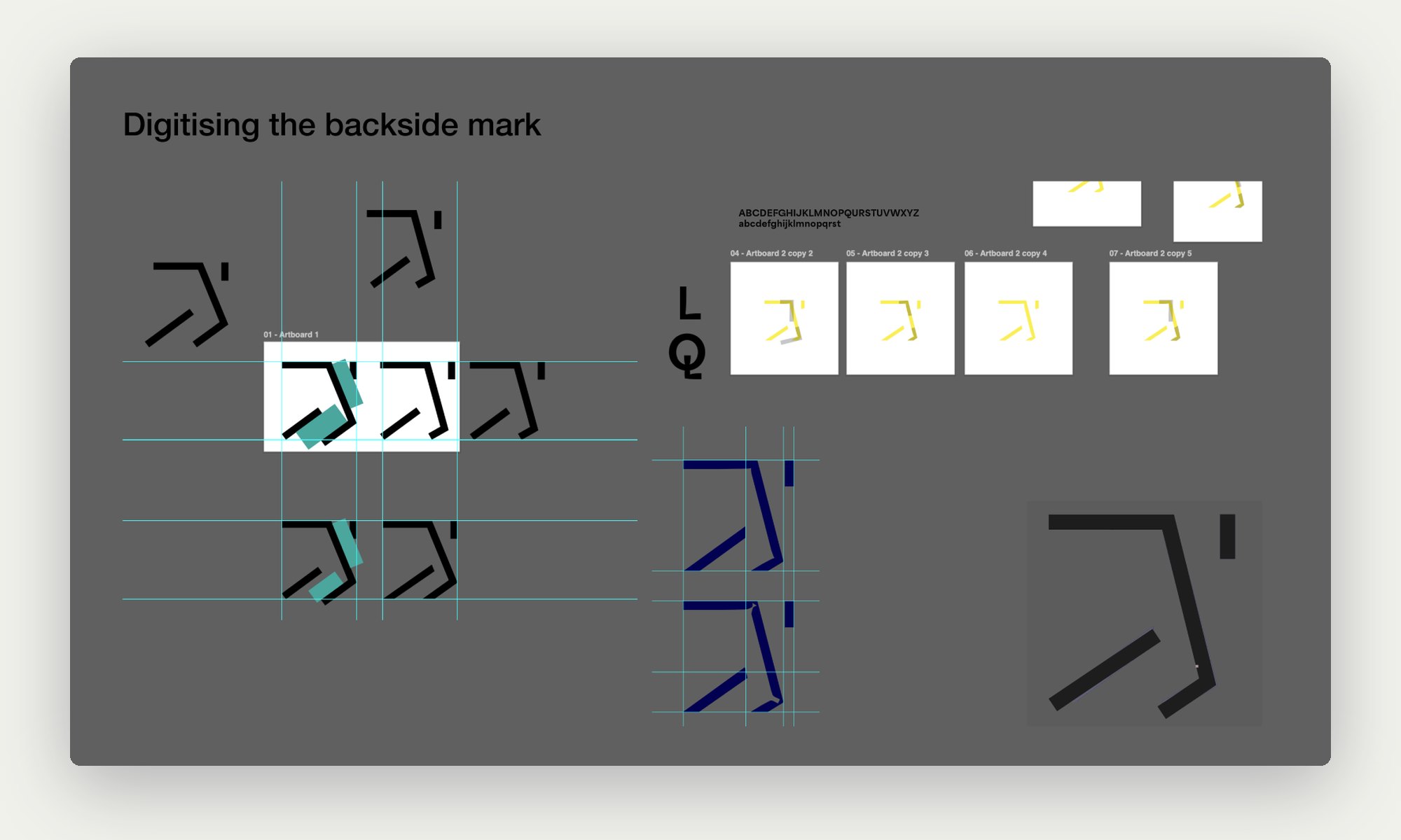
Construction grid for the mark
Construction: angles, gaps and the stroke that reads as a head.

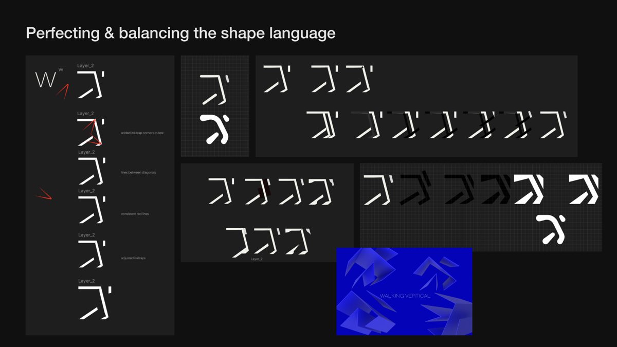
Balancing the shape language

Five days, many versions.

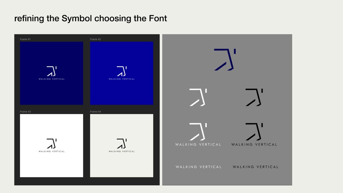
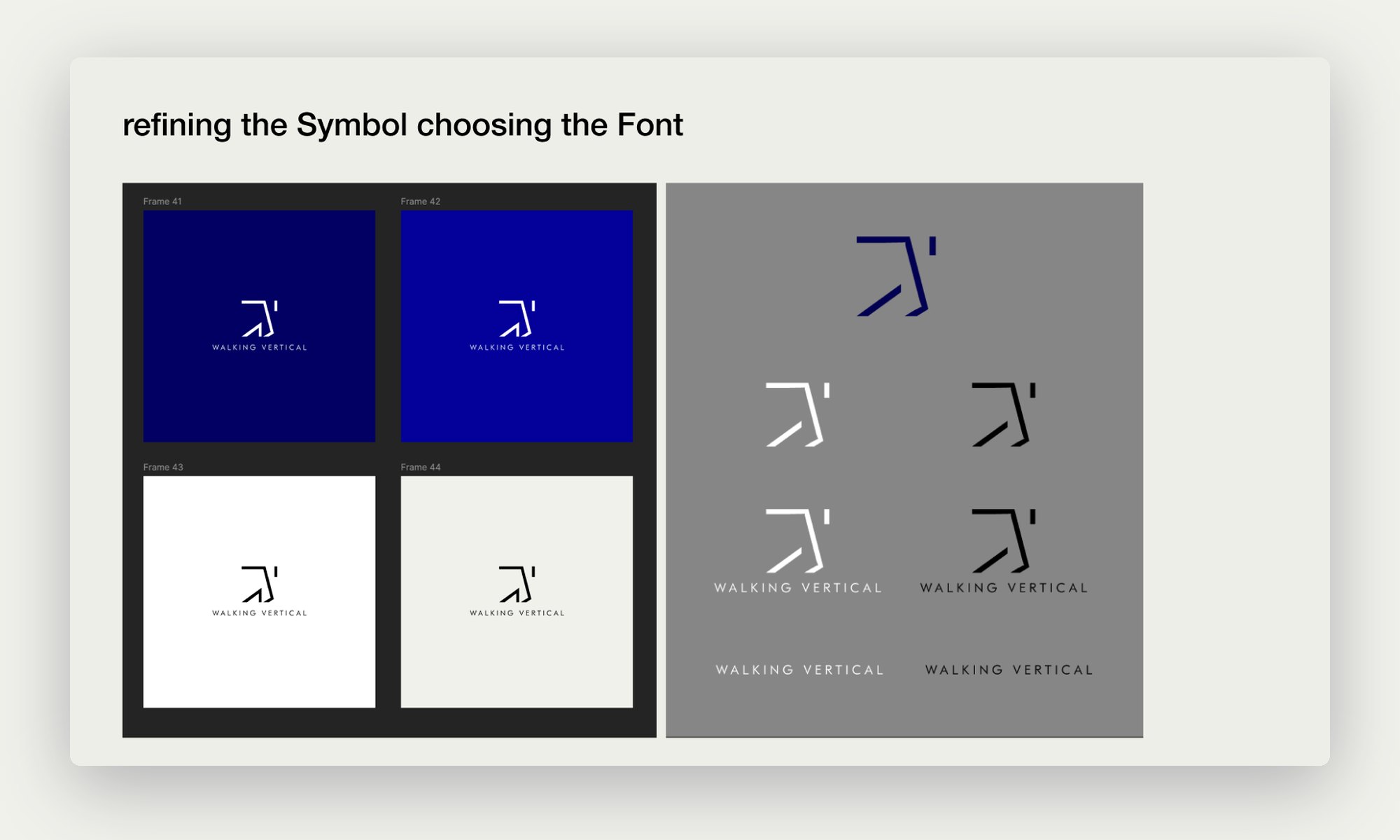
Most of the five days went into balance: stroke weight, the angle of the stride and the small gap that makes the figure read as a person. Then the symbol met its wordmark, tested in Klein Blue, black and white.
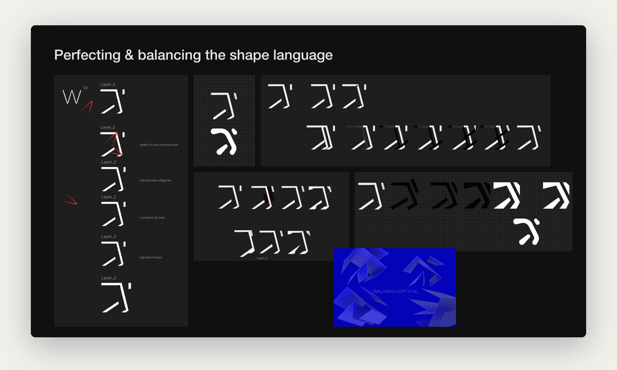
Variations balancing the mark’s shape language
Perfecting and balancing the shape language.
Symbol and wordmark lockups in blue, black and white
Refining the symbol and choosing the font.
06

A palette from the valley, and a system that grew

Branding 2023

Phase 01.

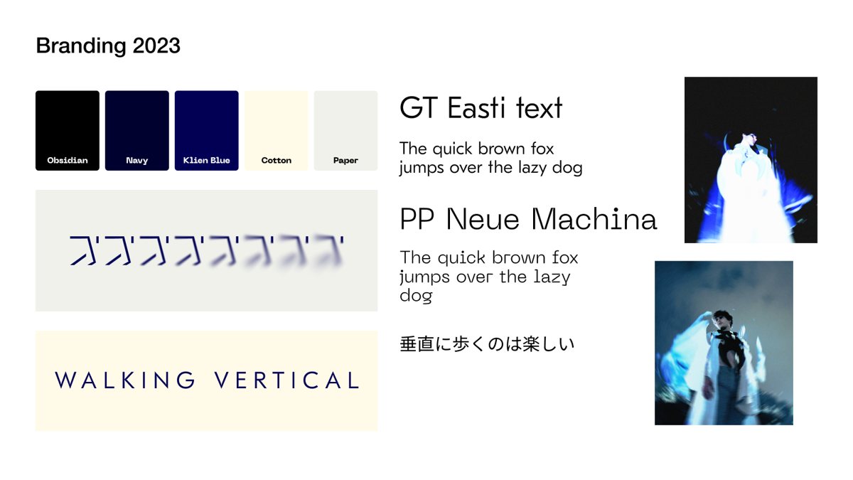
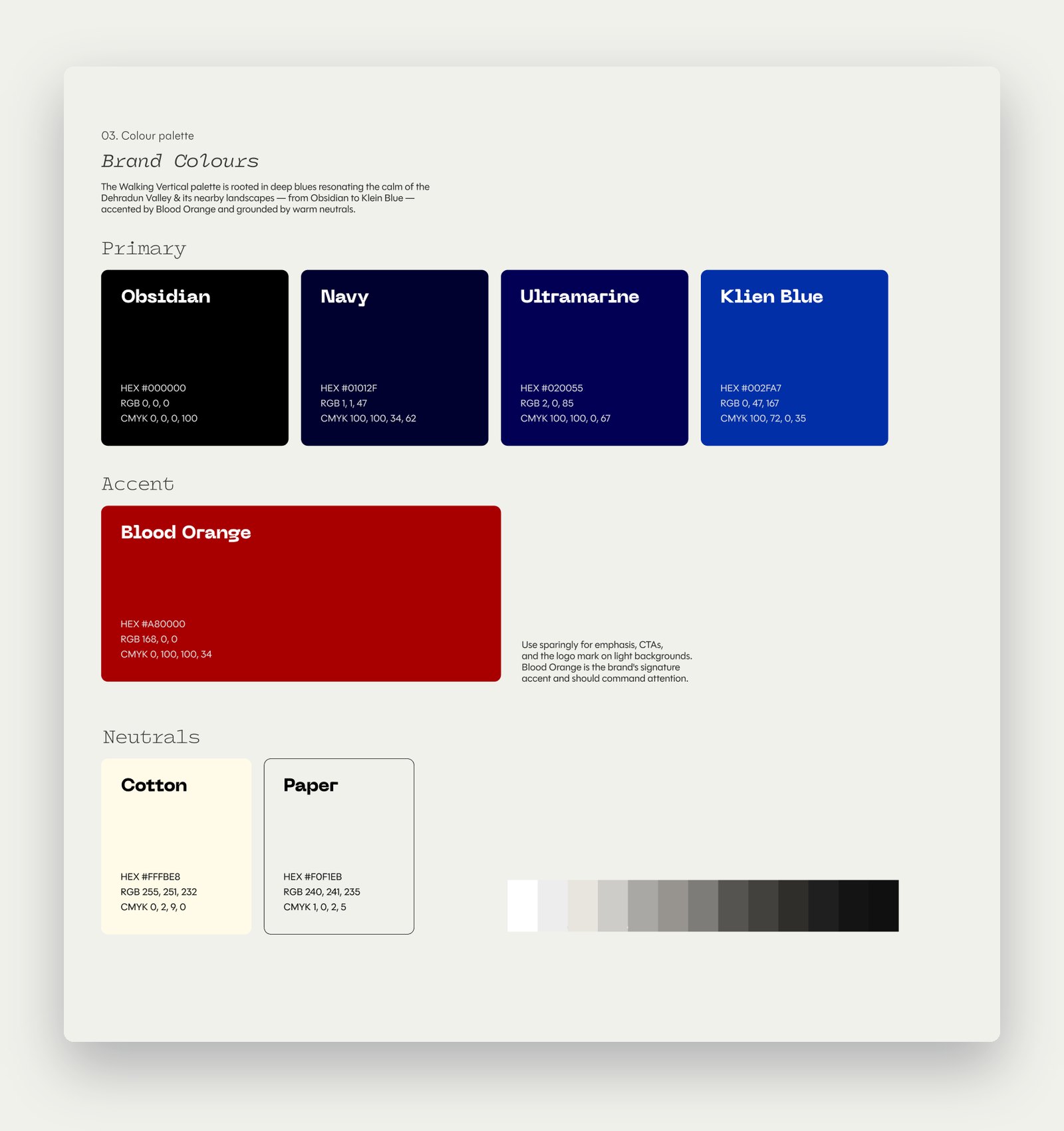
The first system was deliberately small. Obsidian, Navy and Klein Blue for the calm blues of the Dehradun valley, Cotton and Paper for warmth. GT Eesti Text and PP Neue Machina for type. And a line of Japanese, 垂直に歩くのは楽しい, “walking vertically is fun”.
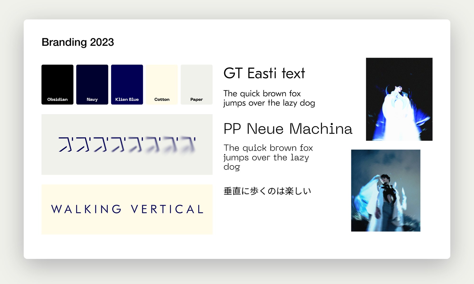
Branding 2023: palette, typefaces and the Japanese line
Branding 2023: palette, type and the Japanese line.

A visual language

Stylescape.

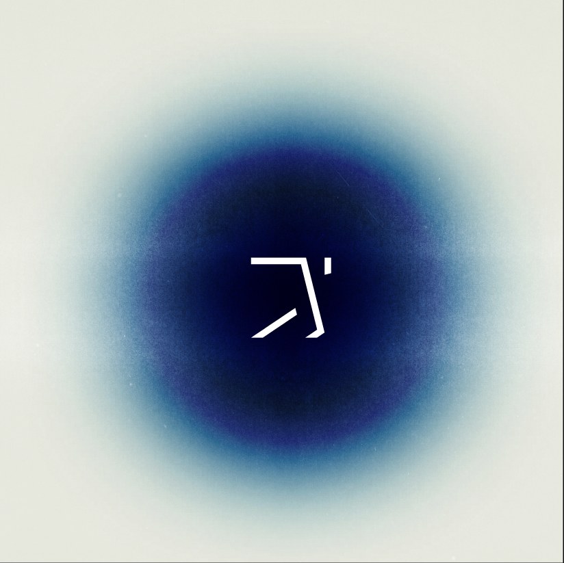
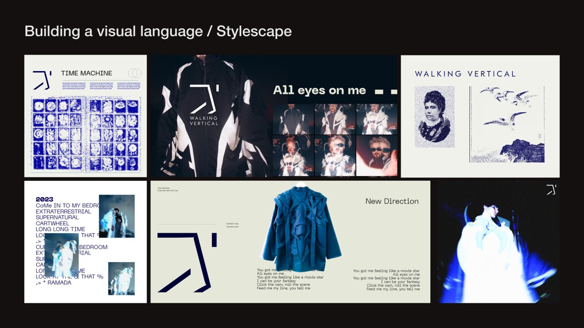
Around the mark we built a language: the mark as a directional arrow, a grid of marks pointing every way for “New Direction”, a luminous deep blue orb, stacked WALKING VERTICAL type, and photo manipulation as part of the image making.
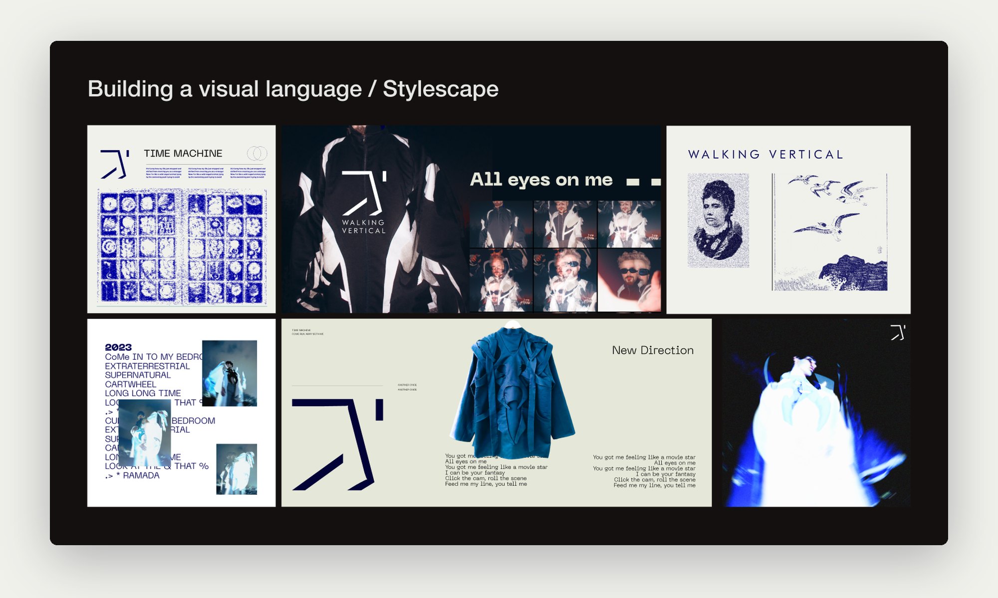
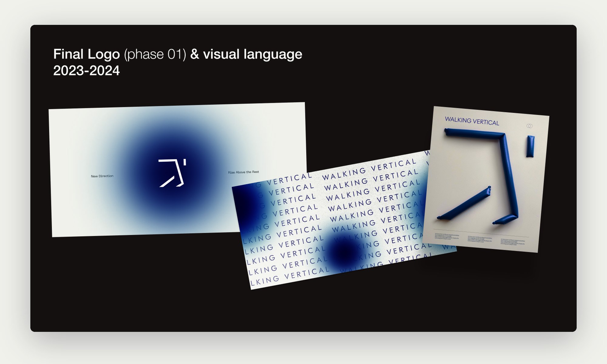
Stylescape for the Walking Vertical visual language
Building a visual language: the stylescape.
Final phase 01 logo and visual language on posters and cards
Final logo (phase 01) and visual language, 2023 to 2024.

Evolution 2025

Deeper, and written down.

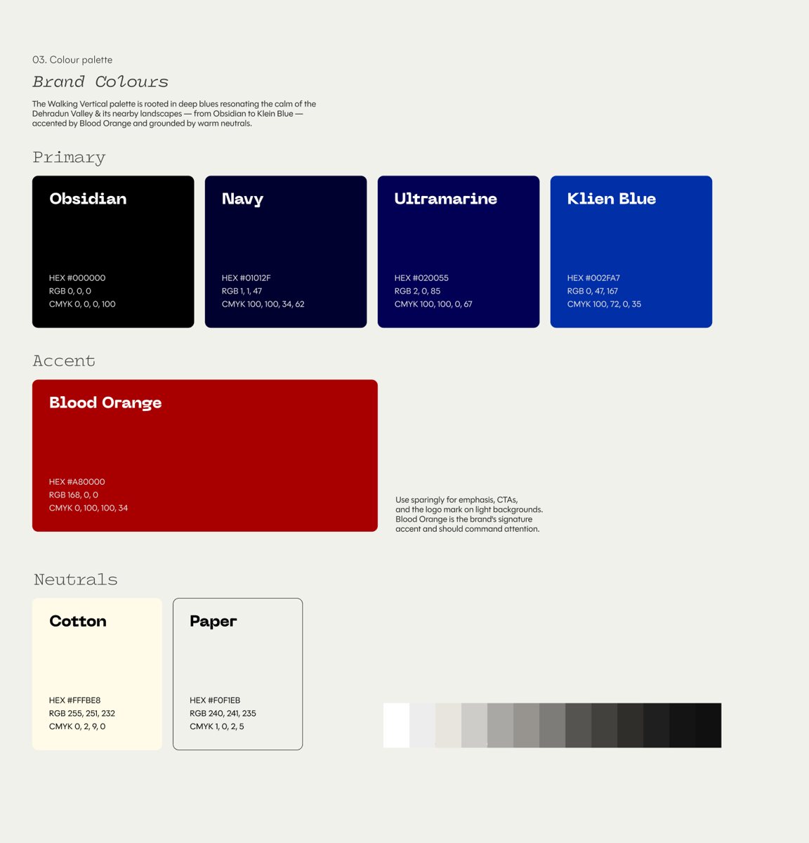
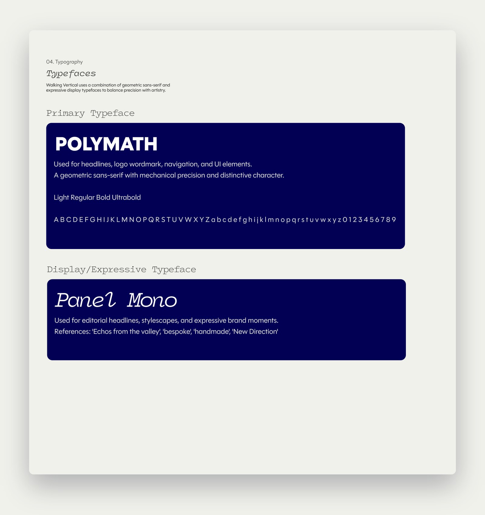
In 2025 the brand grew up. The blues got deeper with Ultramarine, Blood Orange arrived as a rare accent for emphasis, and the type moved to POLYMATH and Panel Mono. For the first time we wrote it down: a guidelines document for photographers, UI designers, art directors and interns, covering the logo system, usage, colour, type, imagery and brand elements.
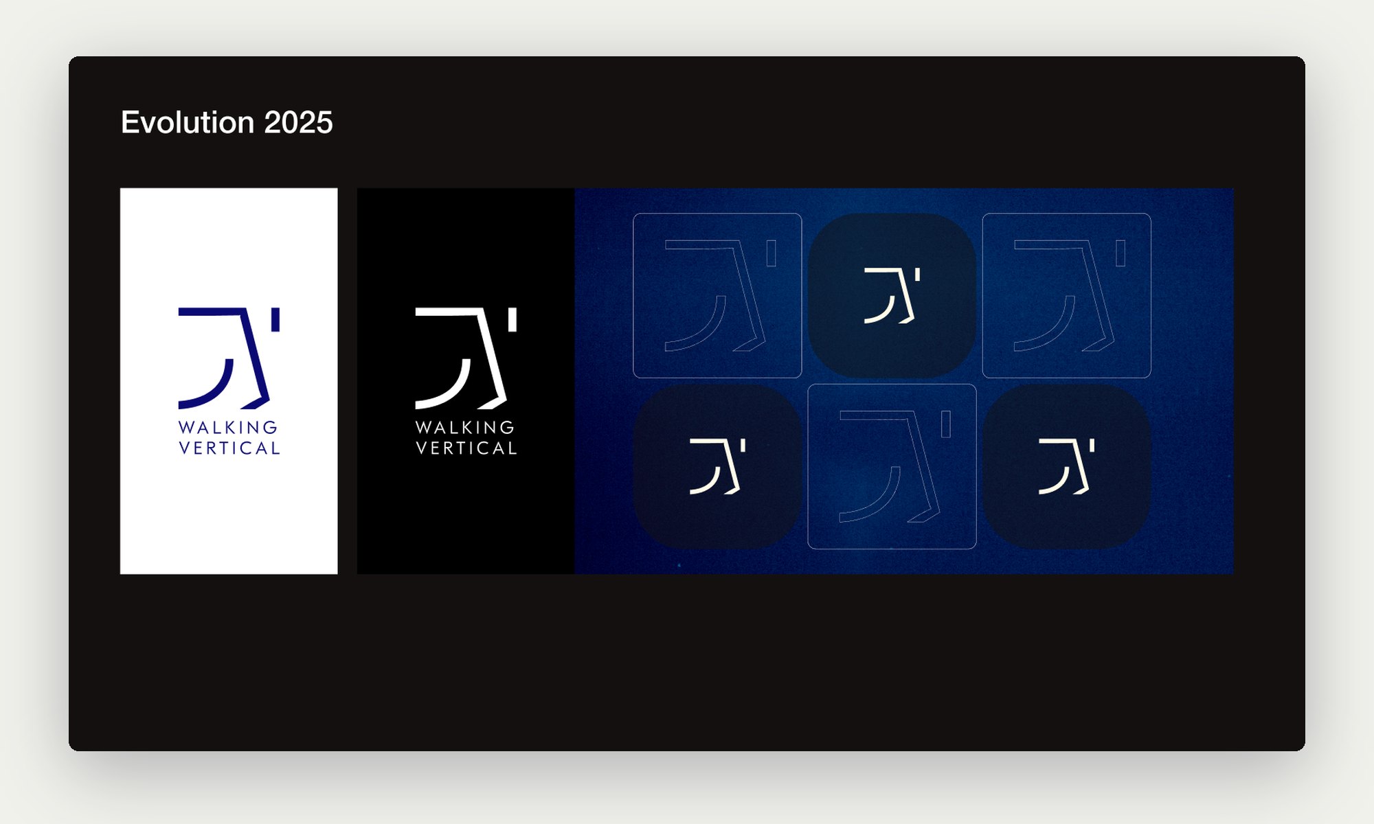
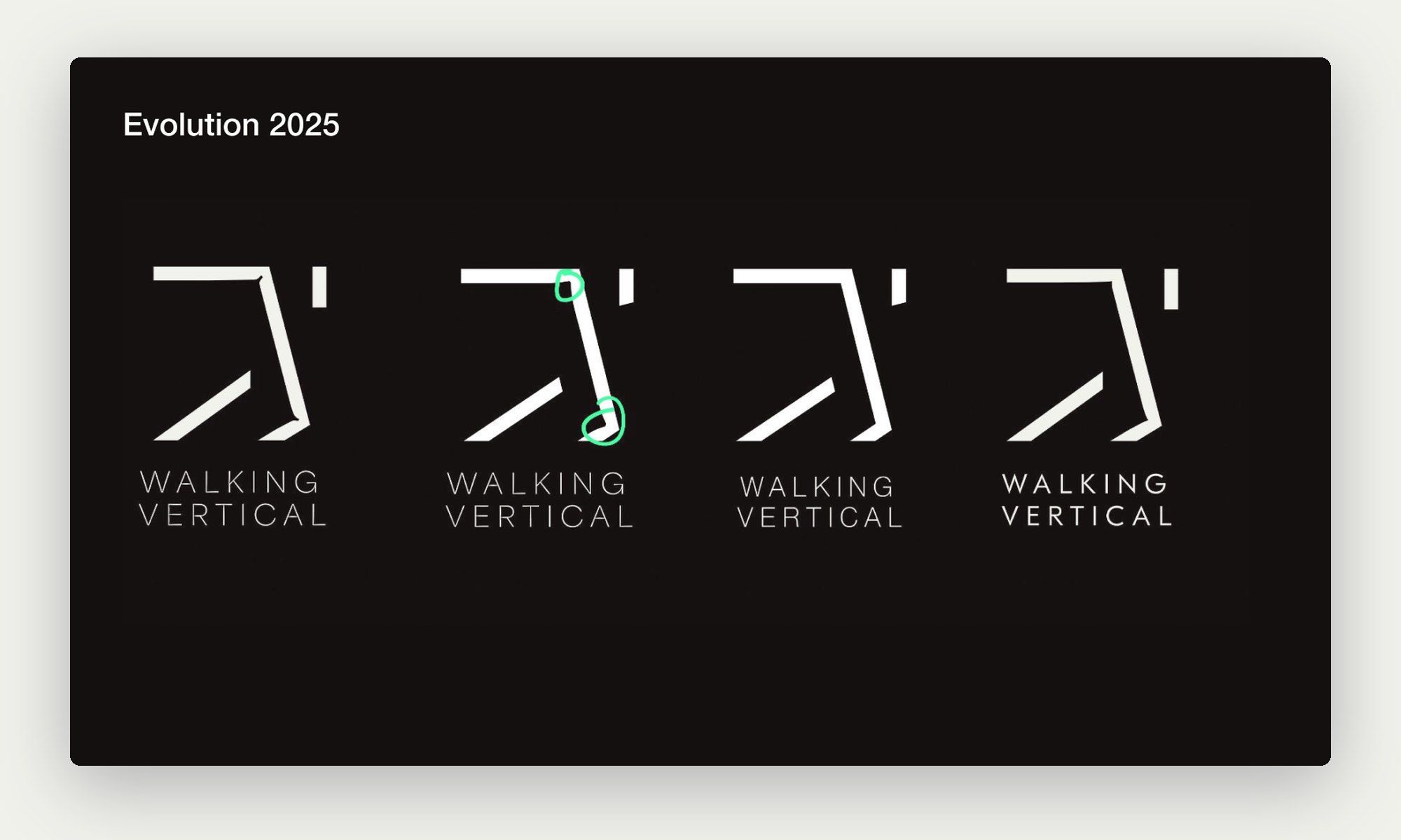
The 2025 mark on white, black and blue tiles
Evolution 2025: the mark on its new grounds.
Four refined versions of the mark and wordmark
Evolution 2025: refining the lockup.
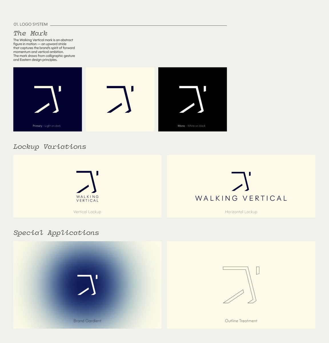
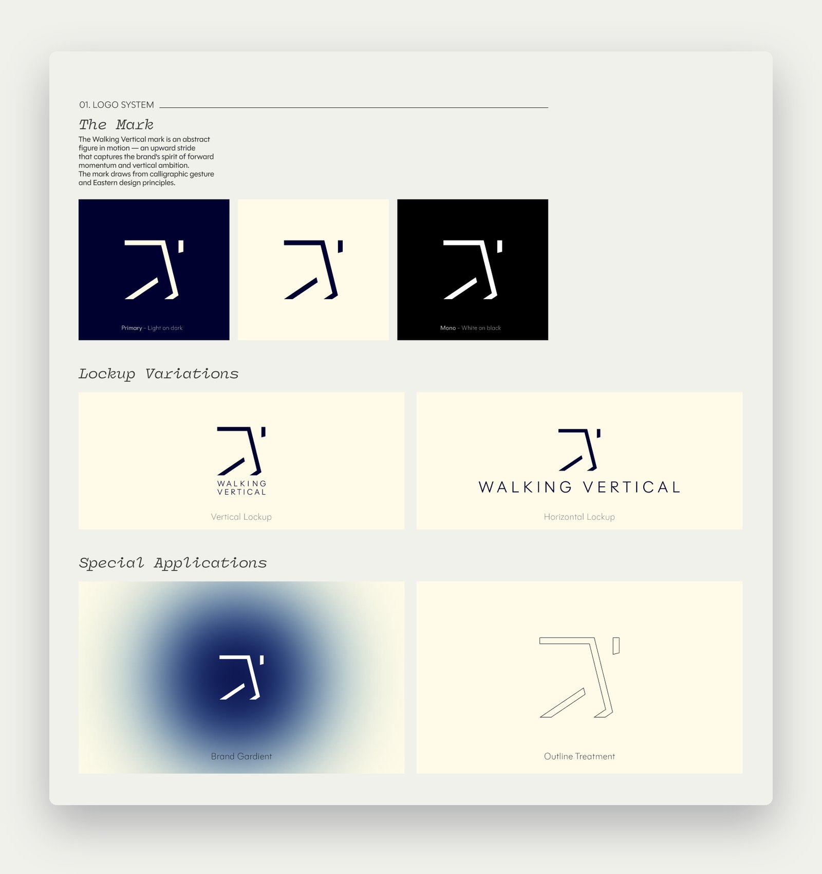
Logo system page from the 2025 guidelines
Guidelines: the logo system and lockups.
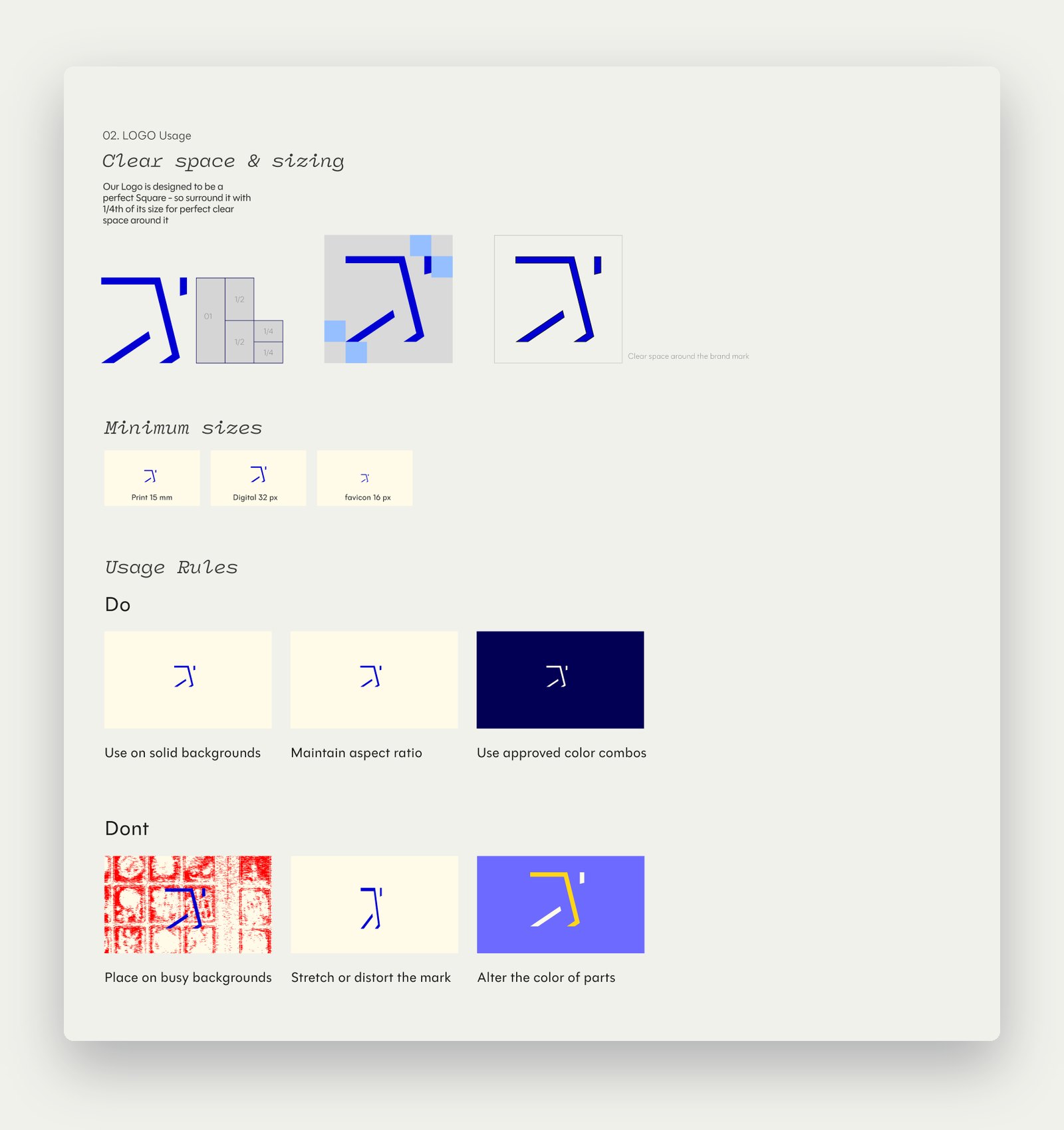
Logo usage page from the 2025 guidelines
Guidelines: clear space, sizes and rules.
Colour palette page from the 2025 guidelines
Guidelines: Obsidian, Navy, Ultramarine, Klein Blue, Blood Orange, Cotton and Paper.
Typography page from the 2025 guidelines
Guidelines: the 2025 type pair.
07

In the world, and what I would change

Applications

Tags, posters, streets.

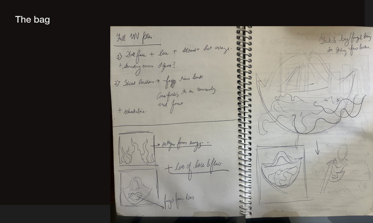
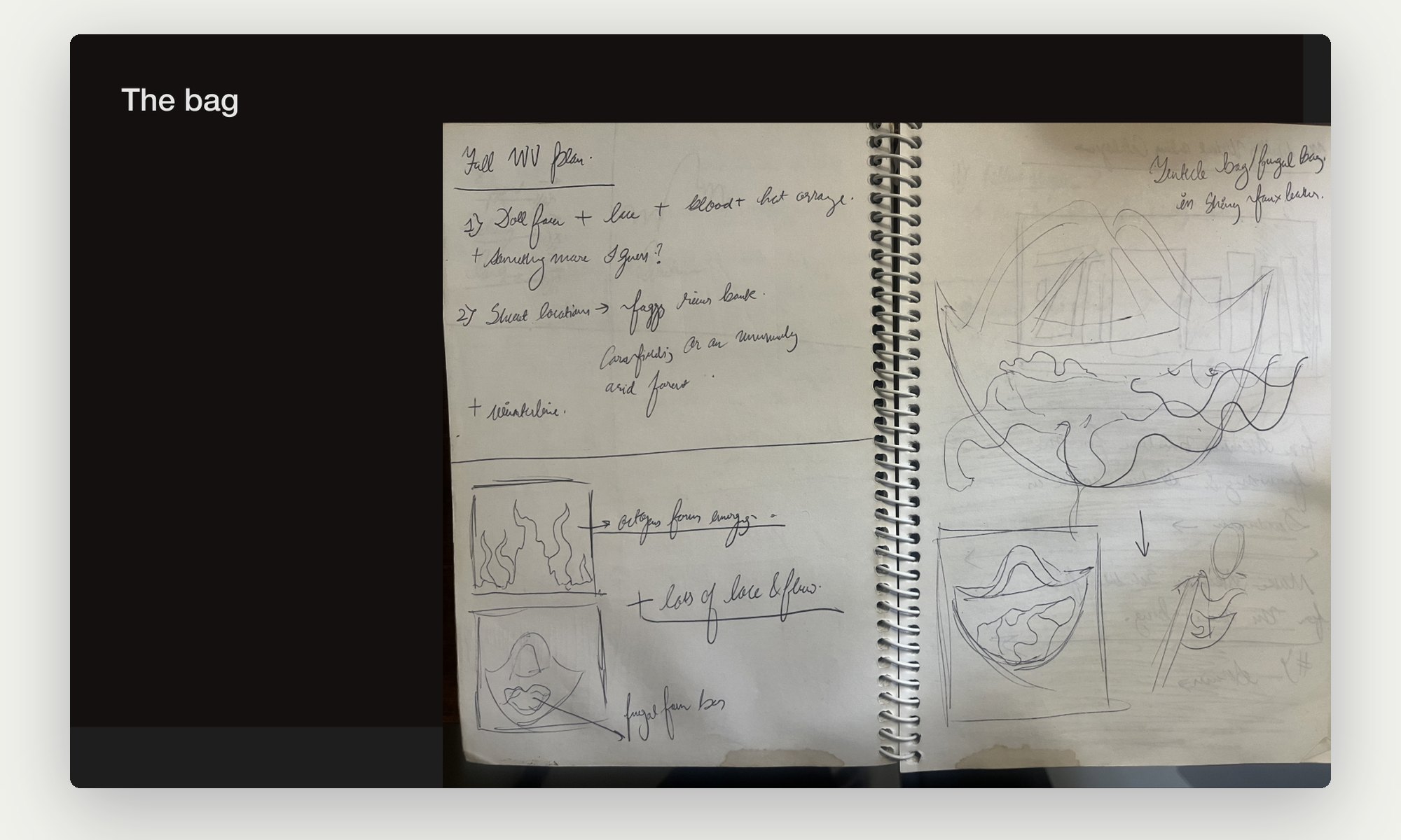
The mark went onto hang tags, posters for the Deconstructed Reconstruction drop, and clothes worn on the street. In 2024 we shot a conceptually bold story around a stuffed bag, from sketchbook to set.
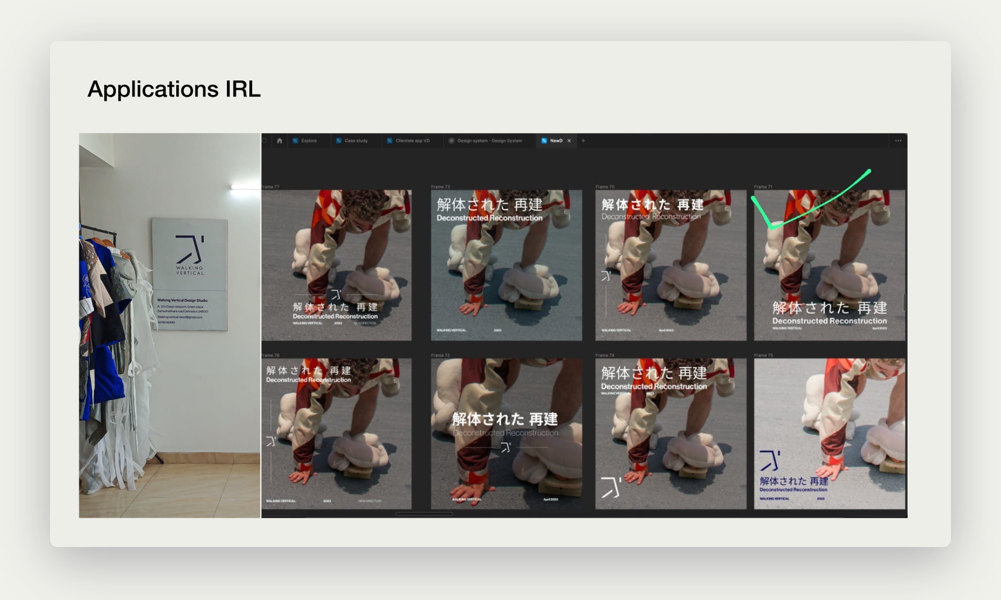
Posters and hang tags with the Walking Vertical mark
Applications: posters and tags.
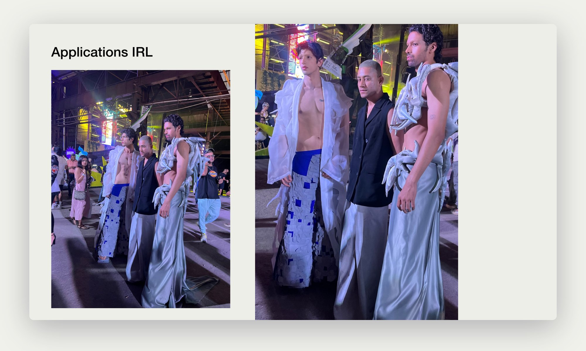
Walking Vertical garments worn at a night event
Applications: the clothes, worn.
Sketchbook pages for the stuffed bag
The bag: sketches before the 2024 shoot.

Capturing Dehradun

Shot where it is made.

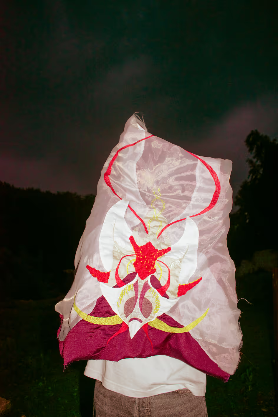
Photography stays close to home: golden hour, pine forests and plain walls in Dehradun, with the clothes as the only loud thing in the frame.
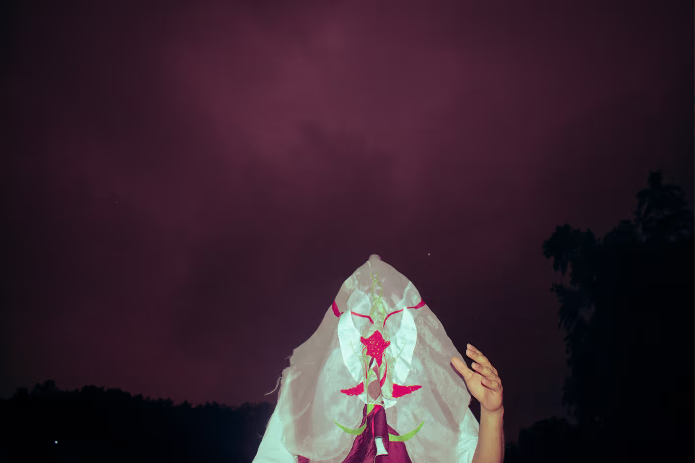
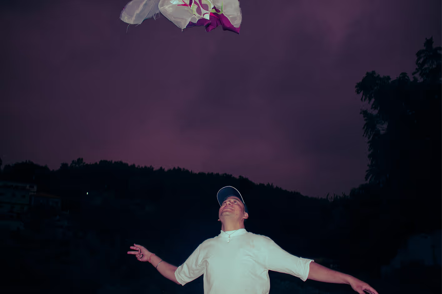
Walking Vertical photography in Dehradun
Dehradun.
Walking Vertical photography in Dehradun
Dehradun.
Walking Vertical photography in Dehradun
Dehradun.
Walking Vertical photography in Dehradun
Dehradun.
Walking Vertical photography in Dehradun
Dehradun.
Walking Vertical photography in Dehradun
Dehradun.

More photoshoots

On Instagram.

Shoots, edits and reels from 2022 onwards, as they went out.

Press and shows

Where it travelled.

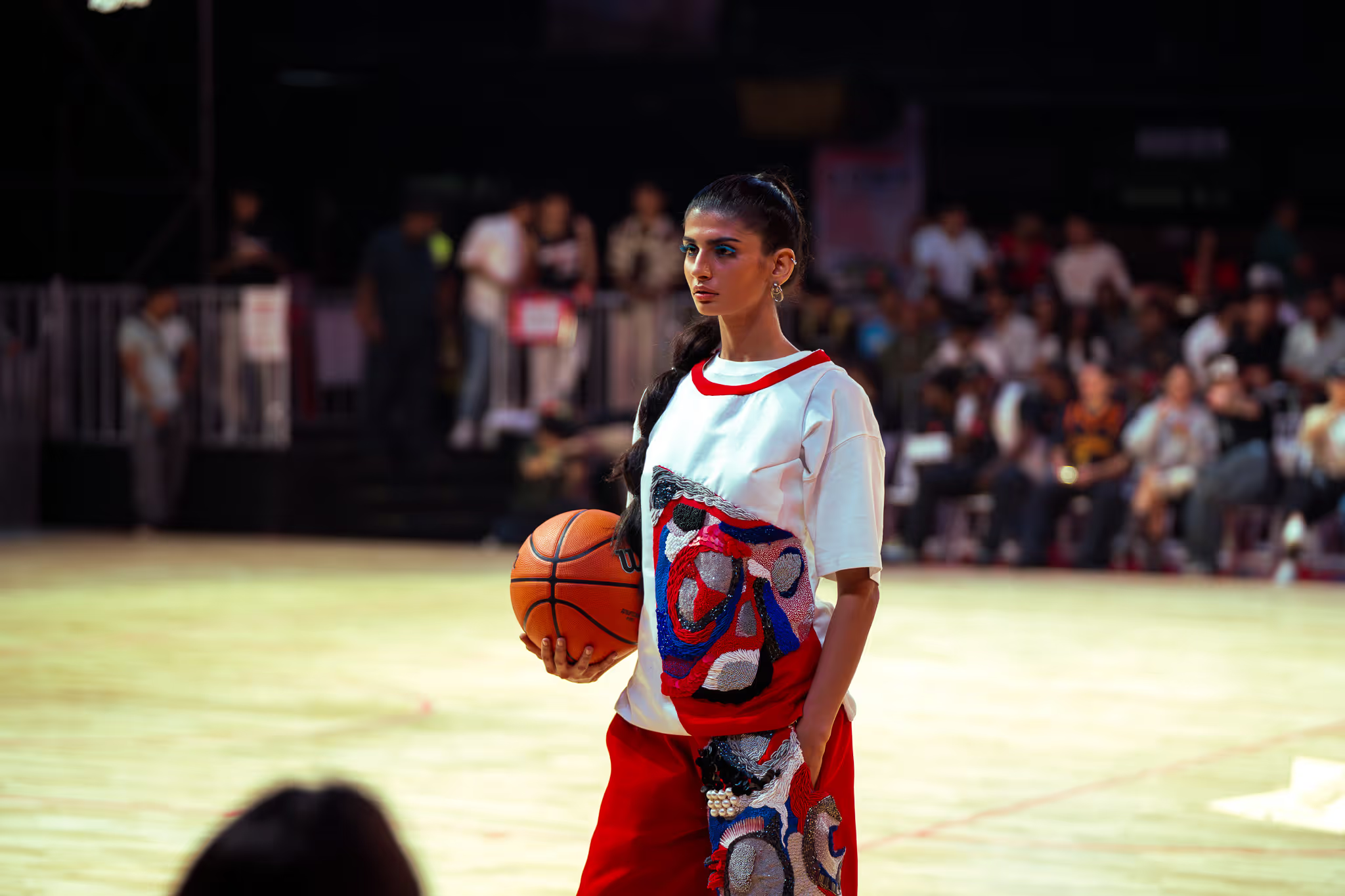
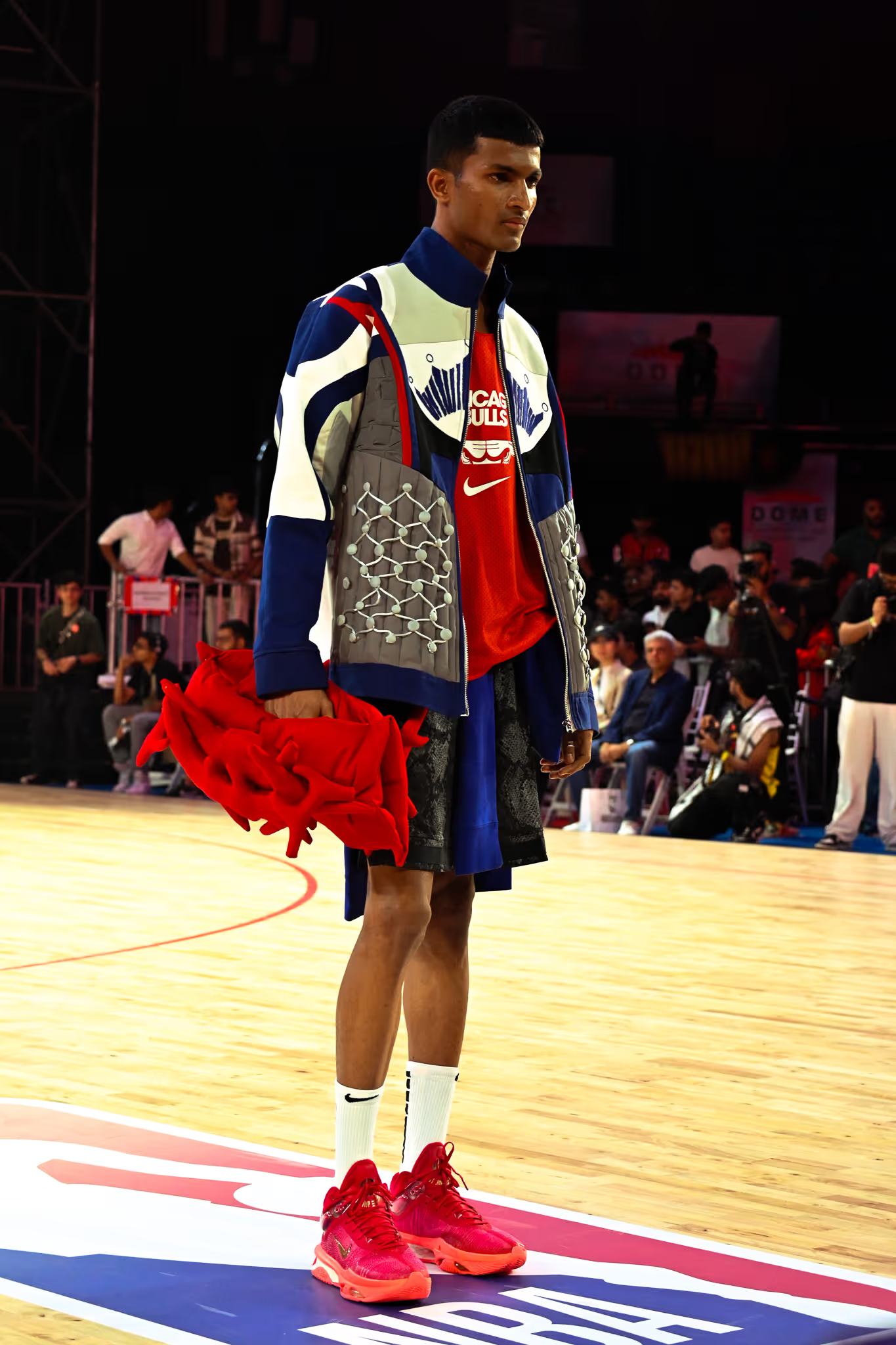
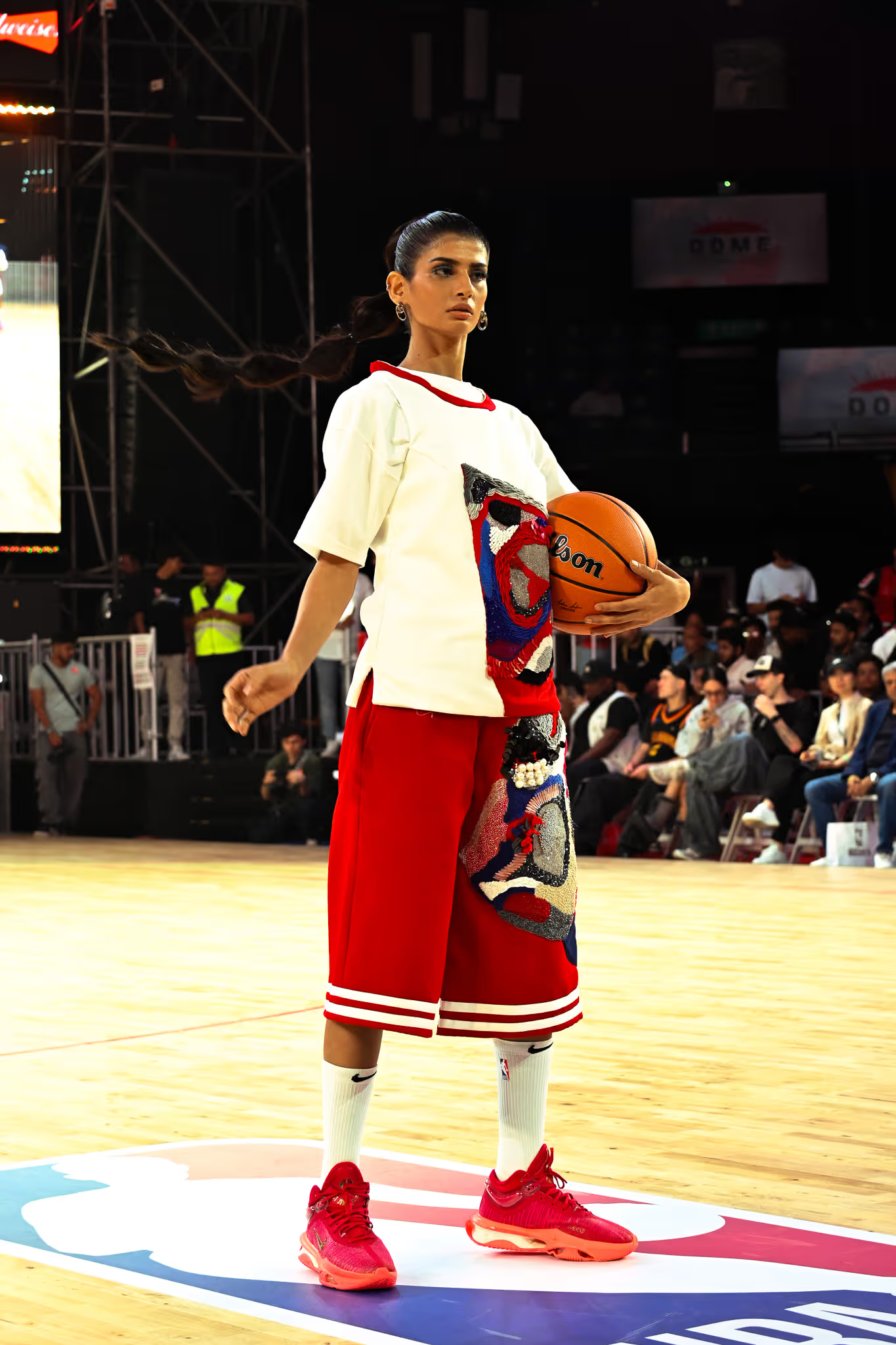
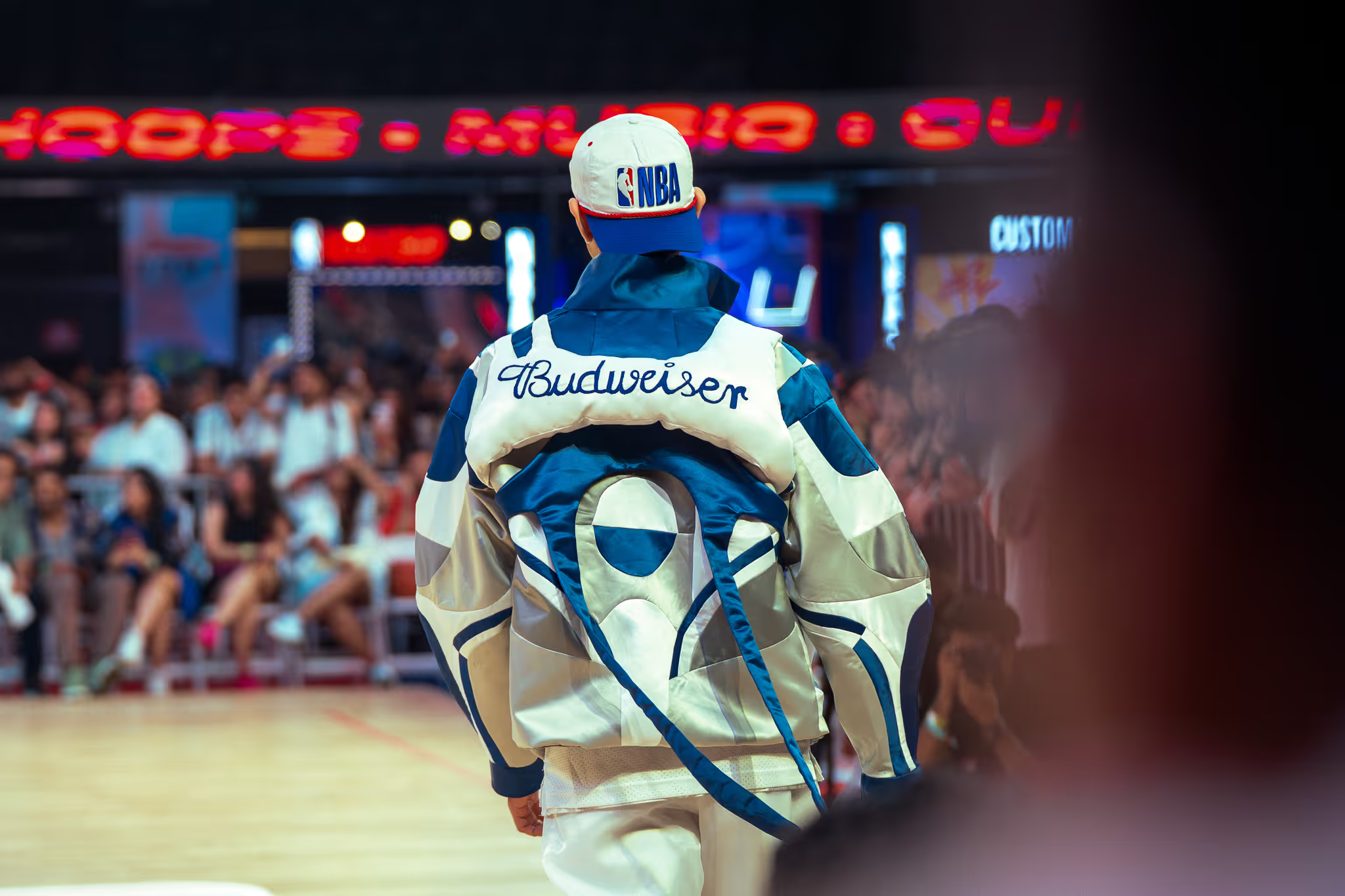
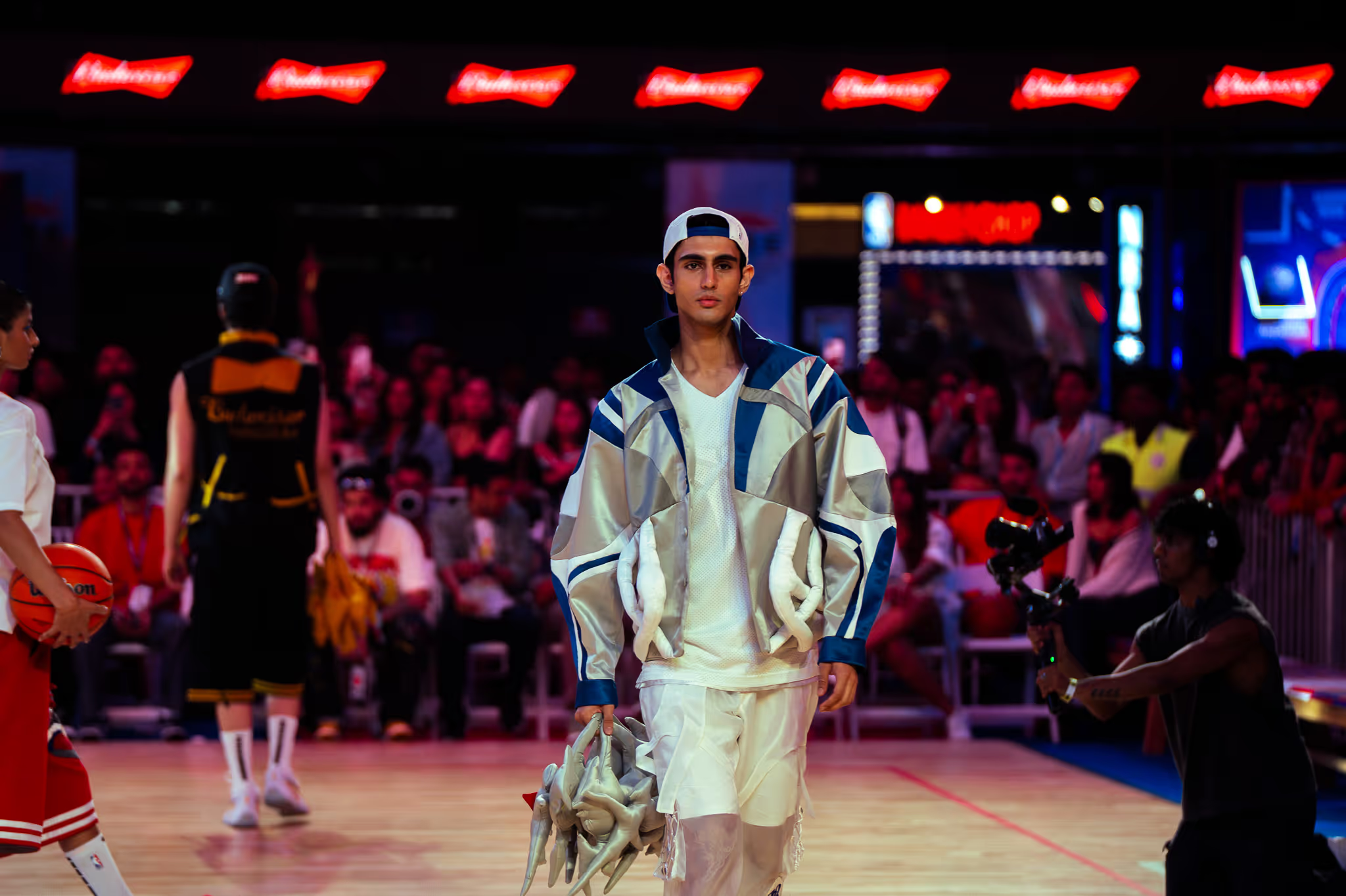
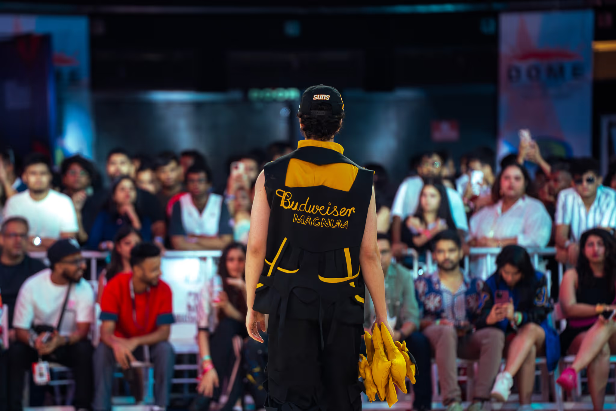
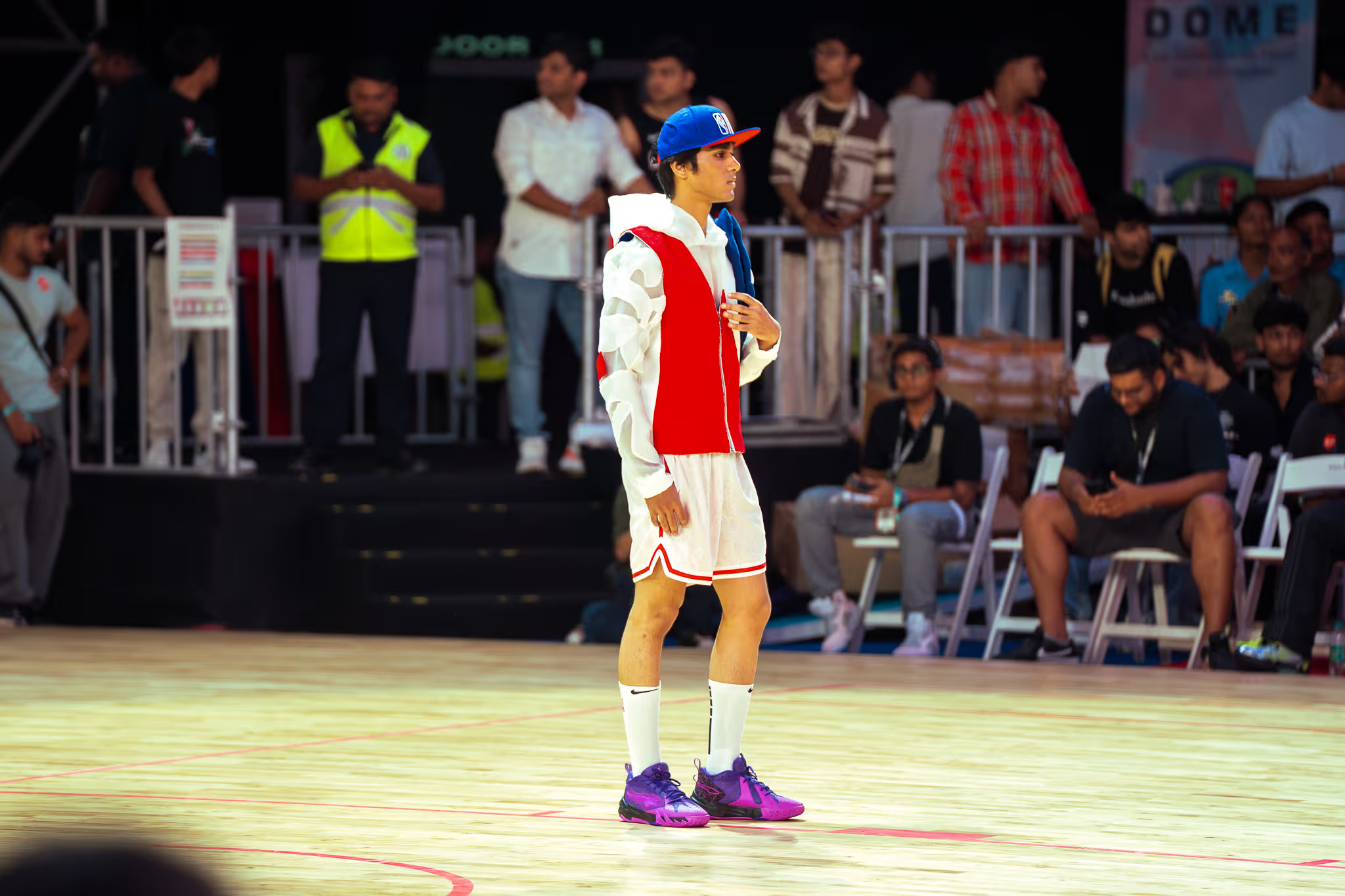
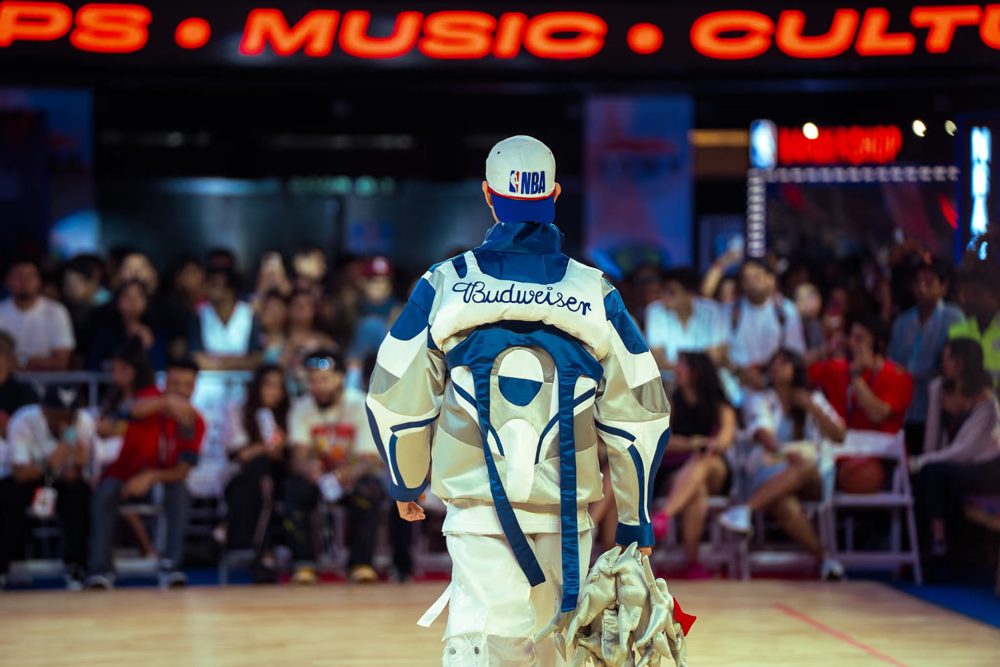
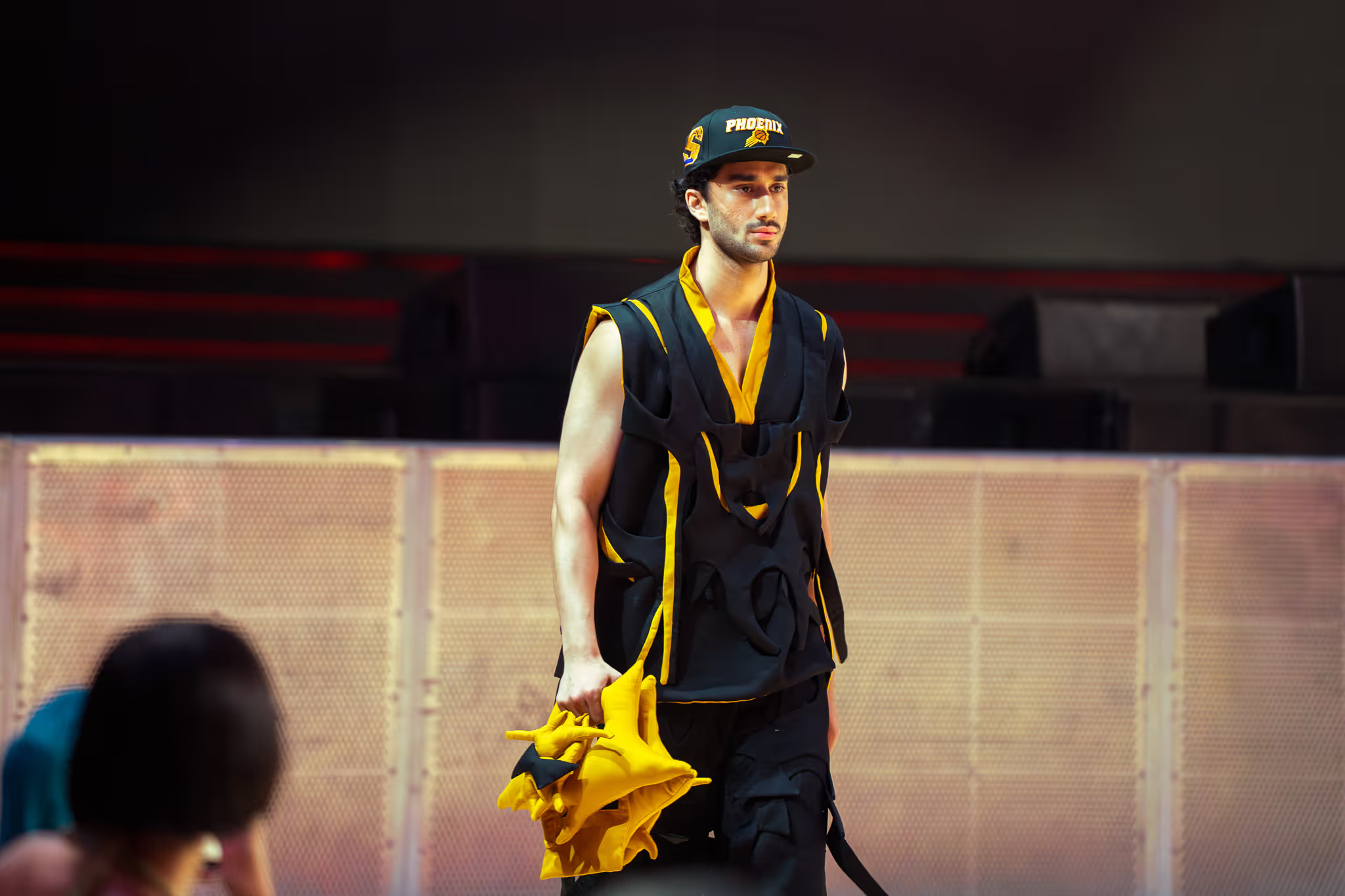
Walking Vertical has been featured in Grazia, GQ India, Elle, Homegrown and Platform. In May 2025 Budweiser and the NBA commissioned a show in Mumbai, where I ran project management, art direction, video design and sound. See the NBA x Budweiser case study.

What I would change

Mostly about writing things down.
01
Write the rules sooner. For two years the brand ran on shared taste between Akash and me. The 2025 guidelines are still an unpublished working document, and earlier rules would have kept every shoot and print more uniform.
02
Choose fonts everyone can use. POLYMATH and Panel Mono tied the brand to an Adobe licence. We have since moved to Epilogue and Anonymous Pro, open fonts that anyone on the team and the Shopify build can use.
03
Keep the accent rare on purpose. Blood Orange works because it is almost never used. That should be a written rule, not a habit.

What I took from it

The best mark was already in the garments. My job was to notice it, turn it over, and give it room.

What it built

01
A full identity in five days, drawn from a hand-sewn stitch.
02
Features in Grazia, GQ India, Elle, Homegrown and Platform.
03
A collaboration running since Summer 2022: shoots, films, events and the 2025 evolution.
04
A commissioned NBA x Budweiser show in Mumbai, May 2025.
Next case study
Budweiser x NBA show collection, Mumbai
→